From safe and generic to joyful and 1950s-inspired.
The protein snacking aisle runs on bold claims and hard colour. Twisted Dough made protein cookie dough, and its original jar was a white label with a small logo that gave shoppers little reason to pick it up. Sixteen products across three tiers needed to be easy to tell apart from a few feet away while still reading as one family.
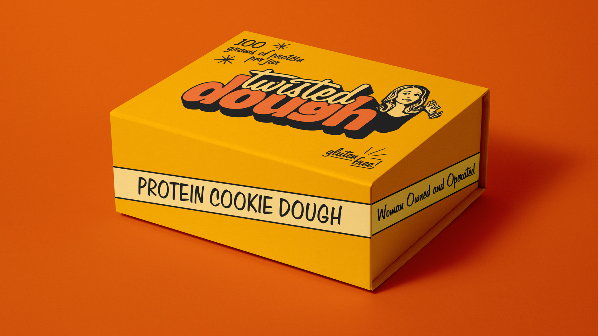
A joyful, 1950s-inspired identity with a stacked logotype, pairing a script "Twisted" against a soft, heavy "Dough." Flavour became the colour system, one saturated ground per SKU. The line supported a reported 28% sales lift.
Before & after
Pick a flavor, then drag the slider · eleven inherited SKUs, eleven redesigns
Logotype anatomy
A script "Twisted," set in Filmotype Jupiter, a late-1950s upright script with continuous strokes and the tone of nostalgic food advertising, the tittle of the "i" replaced with a custom twisted dot, stacks over "Dough" in Doughy Regular, a soft display face with deep inktraps and descenders forced above the baseline. Motion sits above, mass below, putting the swirl and density of the product in one mark.
A late-1950s upright script with continuous strokes, handwritten warmth and the conversational tone of nostalgic food advertising. The tittle of the “i” is replaced with a custom twisted dot, which turns a typographic detail into a brand mnemonic.
Script riding over heavy display, stacked the way 1950s roadside and diner signage was built. One compact silhouette that reads from across a parking lot. Motion sits above and mass below, which puts the swirl and the density of the product in one mark.
Proposed purely on look and feel, for the soft display, the deep inktraps, the tight spacing, the descenders forced above the baseline, and a drop shadow used structurally rather than as decoration.
Execution
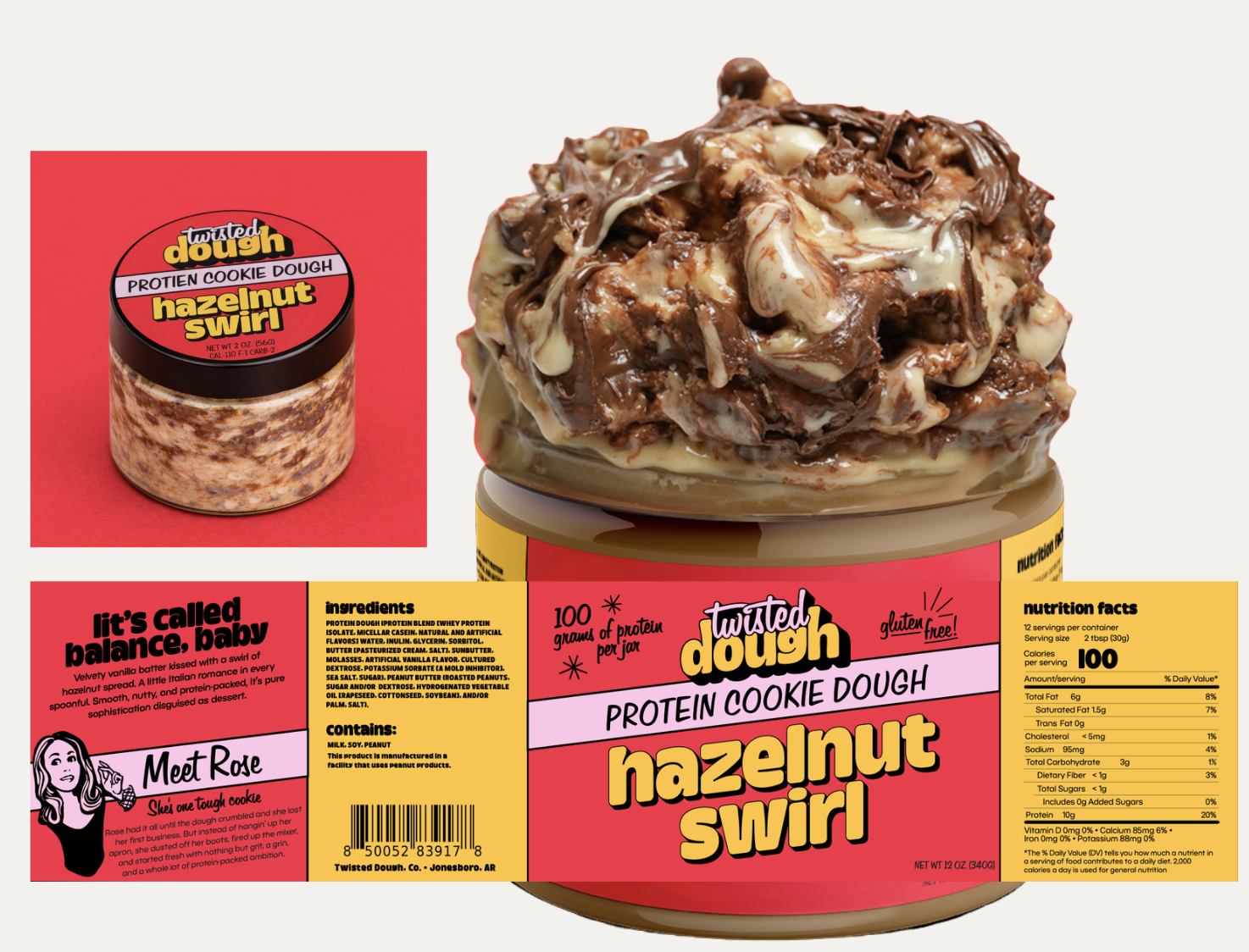
Each variety is signalled by its own colourway, drawn from a set rule for combining ground, logotype and accent colours, and carried across every size so shoppers choose a flavour before they choose a size. Every label was built on a shared dieline system, with a fixed logotype position, a fixed claim band, and the flavour name scaled to fill what's left.
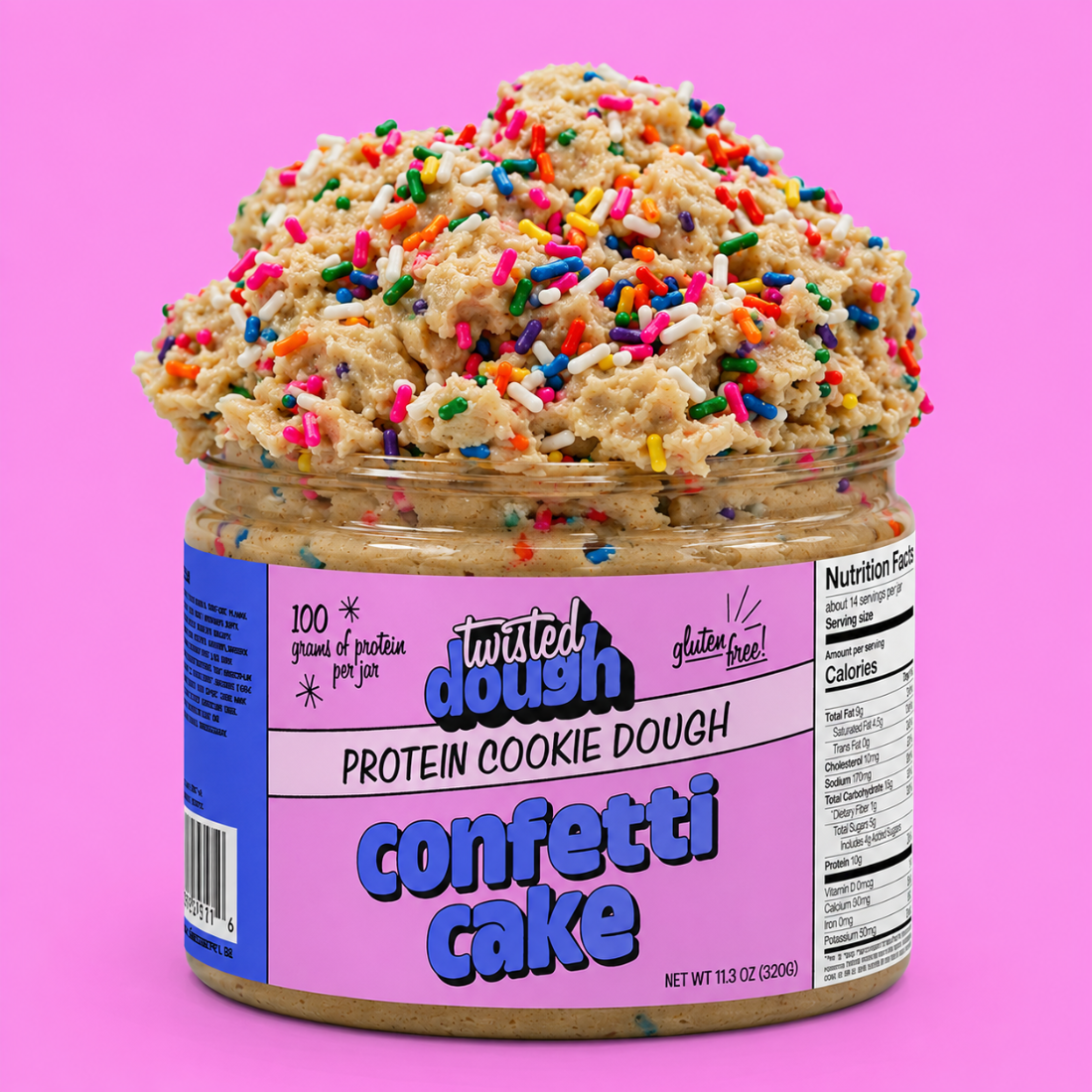
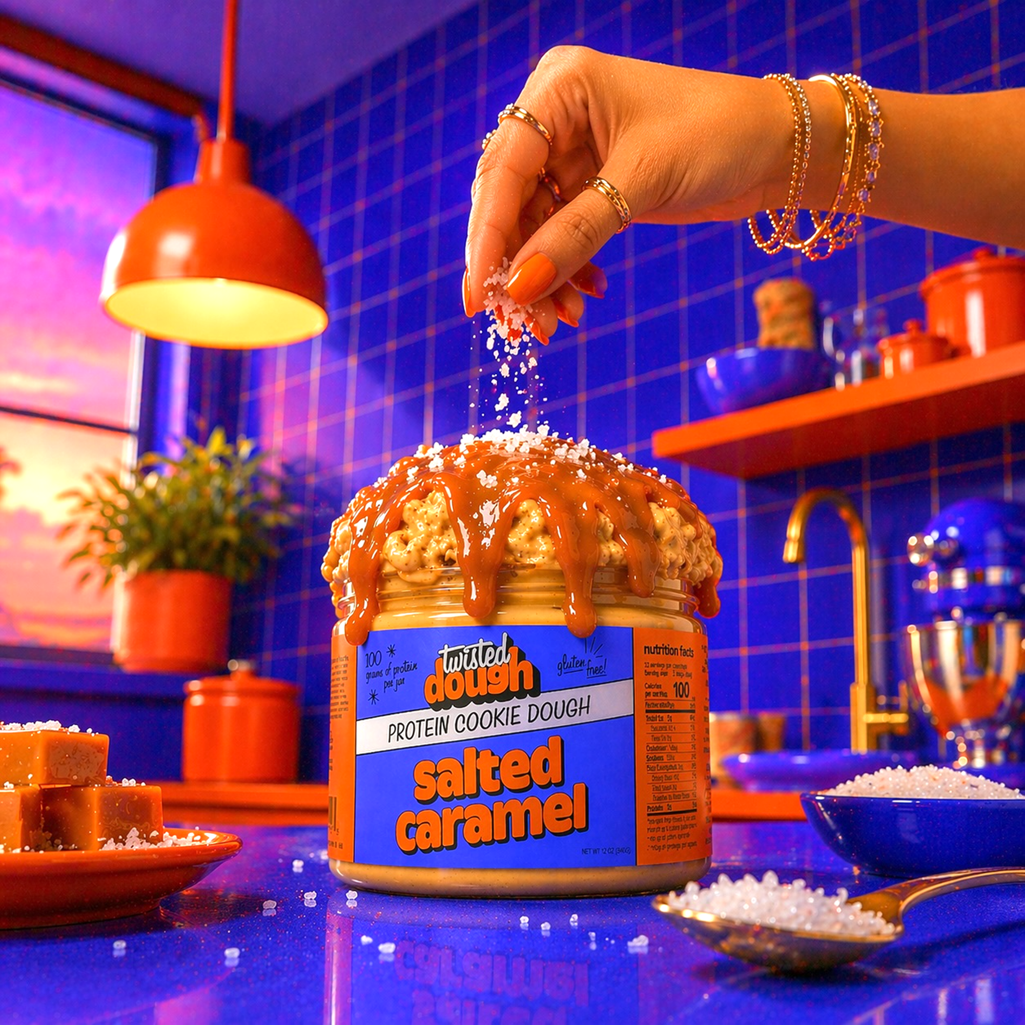
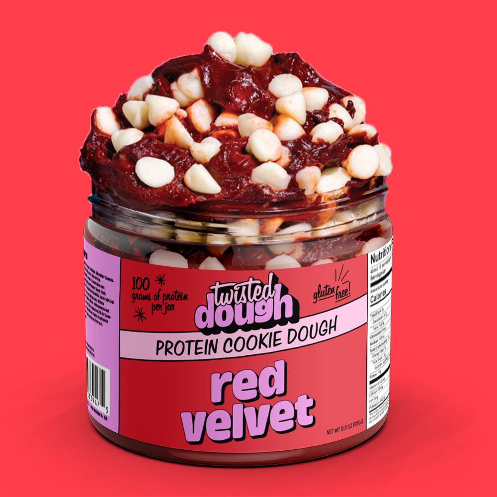
Each jar varies on just two things, the flavour name and the ground colour, like Confetti Cake's pastel pink versus Snickerdoodle's warm tan. Everything else, the stacked logotype, the claim band, the layout, stays fixed, so shoppers can spot the variety they want at a glance.
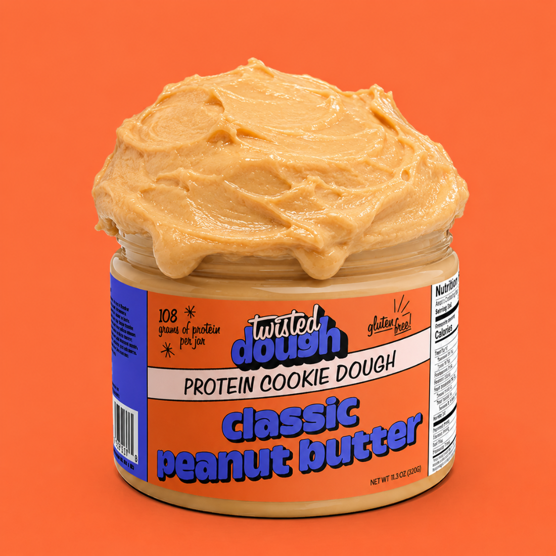
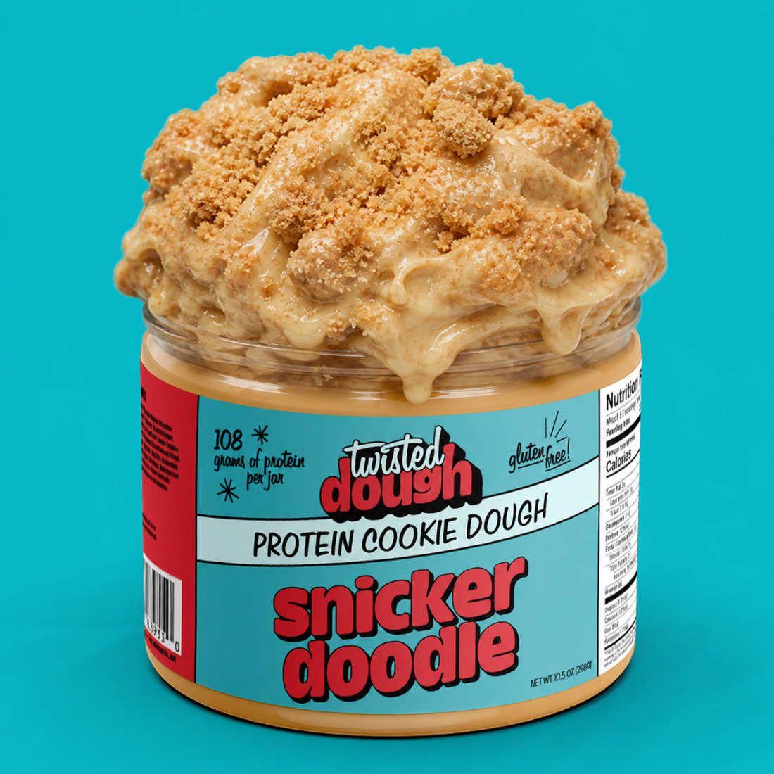
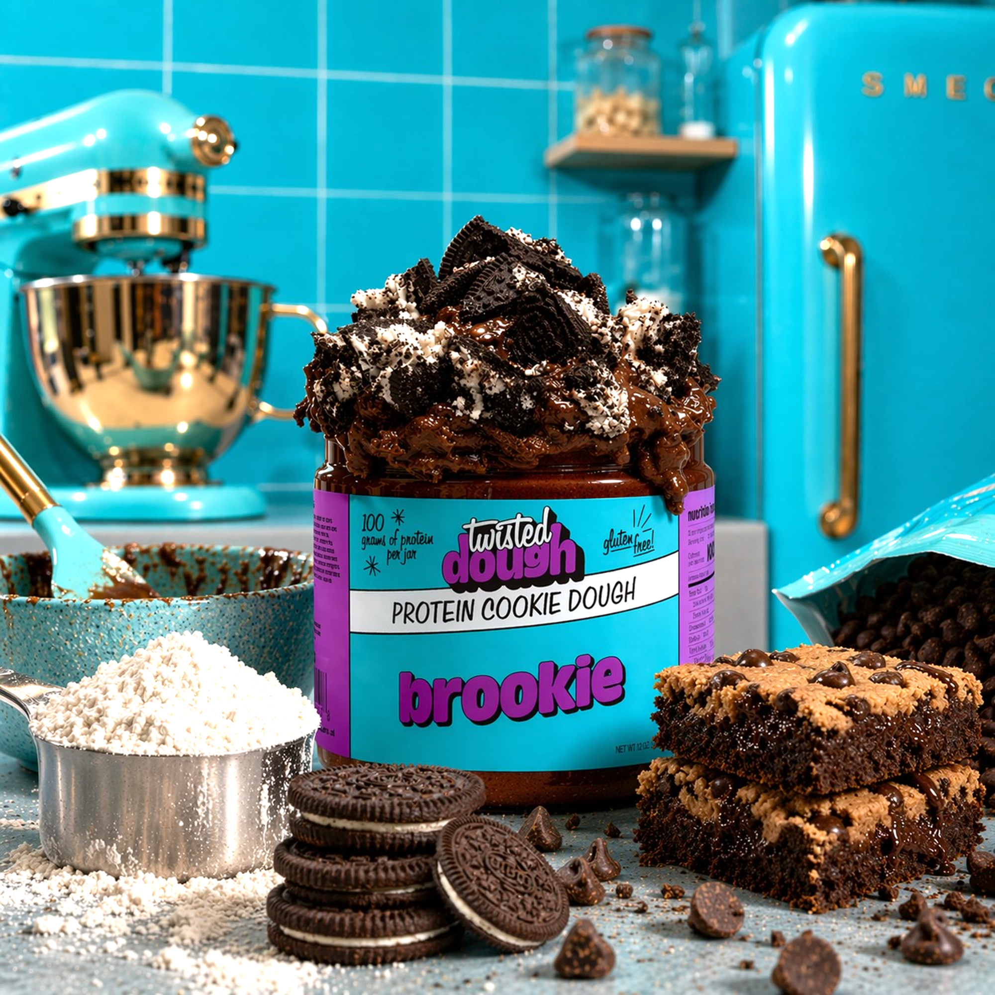
Every colourway ties back to the seven-ink system, so a shopper can jump from Snickerdoodle to Confetti Cake without ever losing the brand.
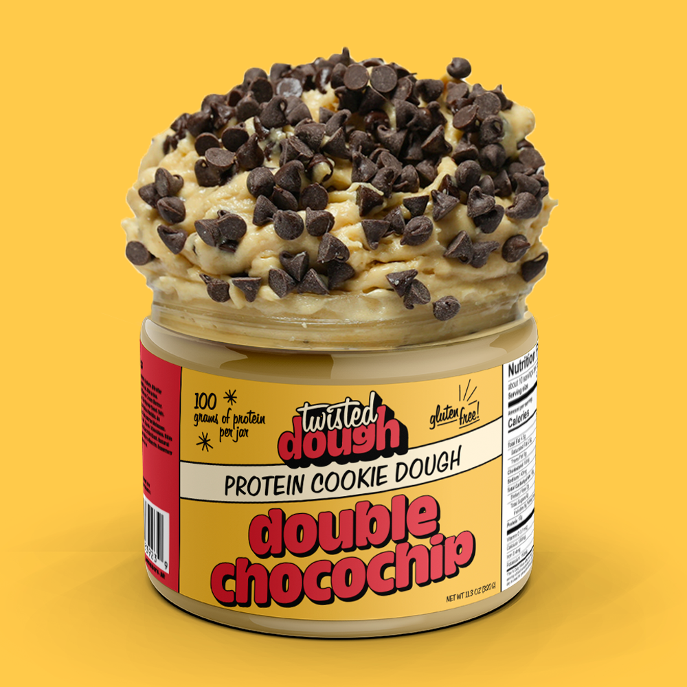


The claim badges borrow directly from 1950s advertising: hand-lettered script, starbursts and sunburst marks, the kind of shorthand mid-century food packaging used to shout a benefit without a paragraph of copy.
Palette & type
Seven inks plus black and white, locked into sixteen approved pairings: the outer field is the label ground, the logotype carries the counter colour, and the bottom fifth is the ground lightened. Black appears only as the hairline and the letter outline, which holds every pairing together at shelf distance.
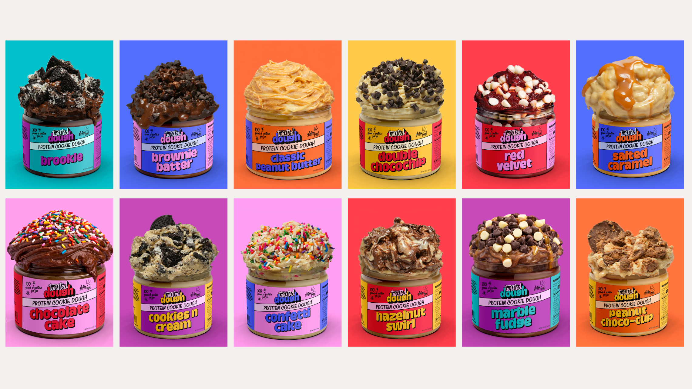
The full range
Thirteen flavours, one saturated ground per SKU. The flavour wall reads as a single brand from across the shelf.

We turned the owner into a character, Rose: a persona built around someone who looks out for her customers and her team, so the brand could carry that warmth even when she isn't the one behind the counter.
D2C site

The site carries the same identity to checkout. The client's one direction going in was that it had to feel bright: high-key studio colour instead of moody product photography, so the jars read as fun and approachable rather than clinical. Visit twisteddough.shop →

Scroll inside the frame · or open the live site
“The name always had the personality. The packaging just needed to catch up to it.”
*Lifestyle scenes were AI-generated by the client's internal team at their request. The packaging, palette, type and label system on the jars are ours; the environments around them are theirs.