Studious
BACK

Designing a city from scratch, one volume at a time.
CLIENT
Sidewalk Labs (A Google Company)
INDUSTRY
Urban Innovation & Technology
WHAT WE DID
Built the content taxonomy from the full research corpus, designed the type and illustration system, hired and directed a four-person team, briefed the outside production partner
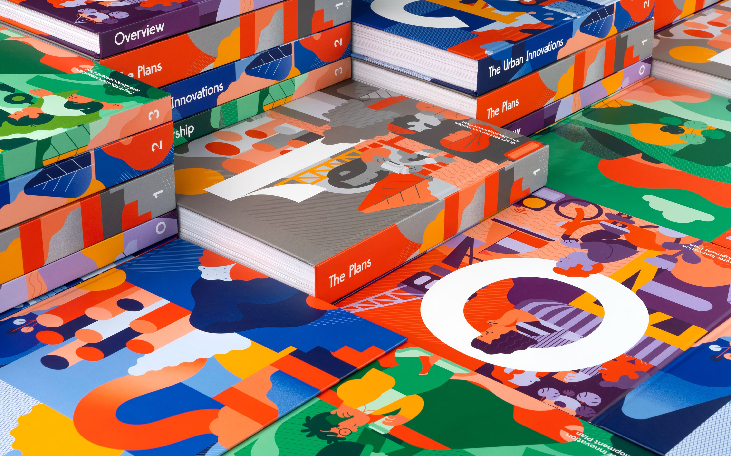
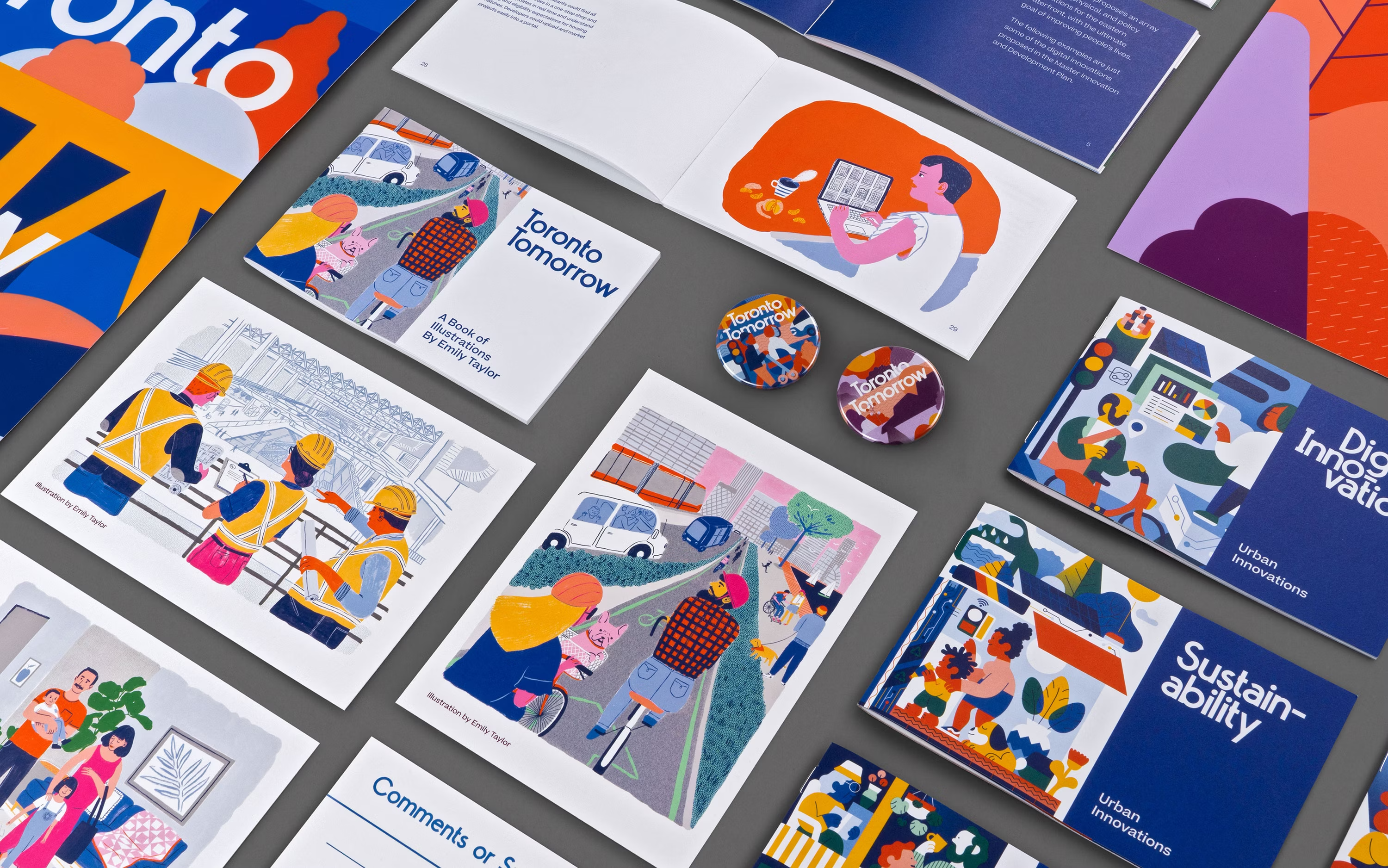
Toronto Tomorrow, four-volume slipcase set

Toronto's eastern waterfront had sat mostly industrial for decades, cut off from downtown by a highway and a rail corridor. A masterplan for a stretch of land like that has to persuade three different audiences at once: the public it will be built for, the city that has to approve it, and the leadership that has to fund it.

Sidewalk Labs had produced thousands of pages of technical, economic, and policy research for the site. The challenge was not more research. It was translation, making a vision of extraordinary complexity legible, credible, and emotionally compelling to Google leadership and the Toronto public alike.
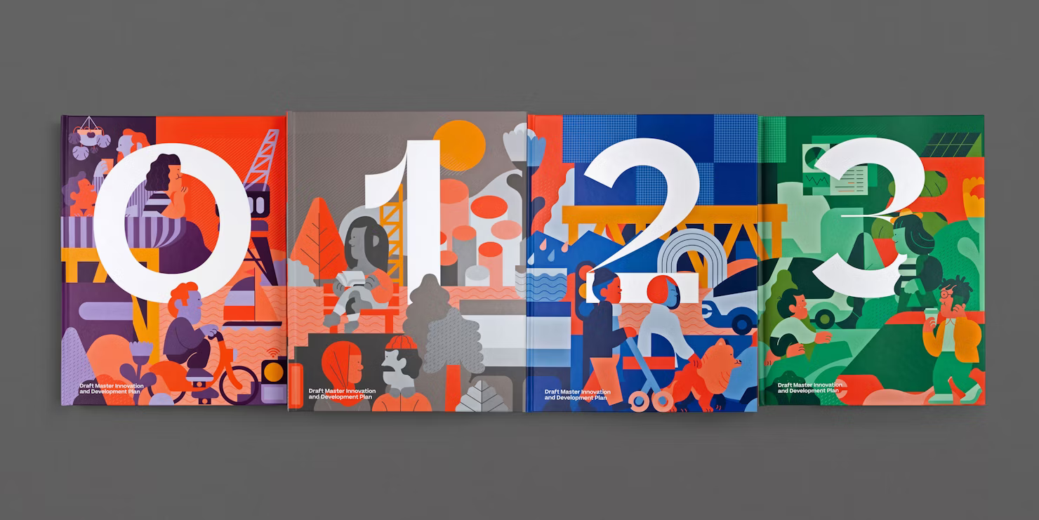
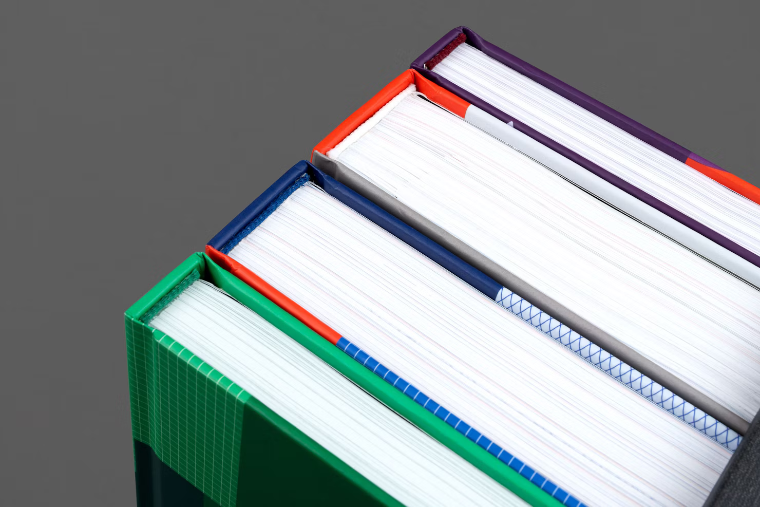
The four volume covers, numbered 0 through 3 Four volumes stacked, spine colours visible on the top edge

Hedof built the cover artwork, a figure-based illustration system that reconfigures across the four covers, section dividers, and exhibition graphics.
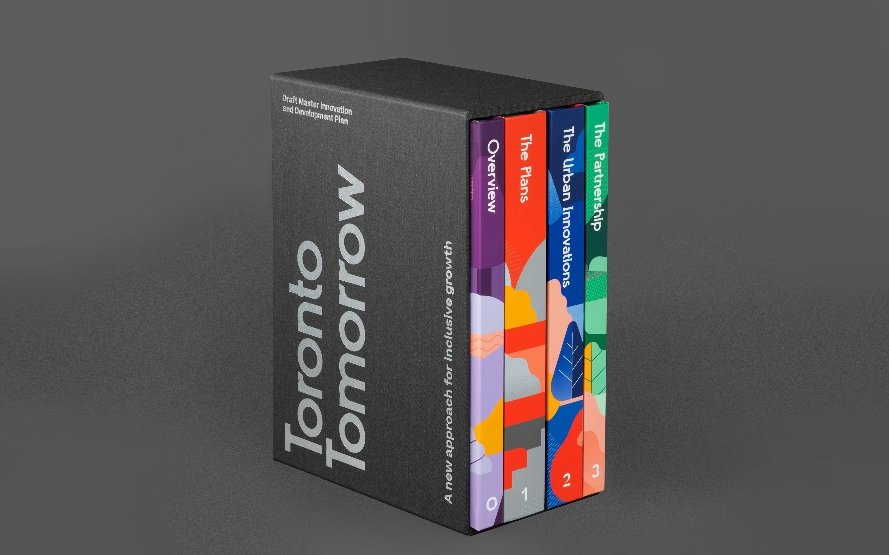
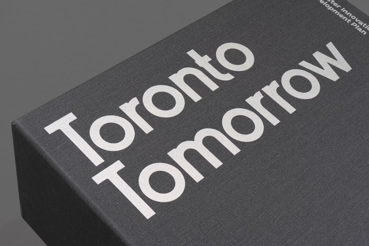
Slipcase and binding, front cover detail Silver foil debossed title, slipcase detail

The Overview

Volume 0, purple. The argument in brief, why the eastern waterfront, what the plan proposes, and what it would mean for Toronto.


Volume 0 cover, The Overview
Opening portrait, eyes closed

Portraiture full-bleed on the opener, a deliberate reversal of the plan's own renderings-first hierarchy elsewhere.
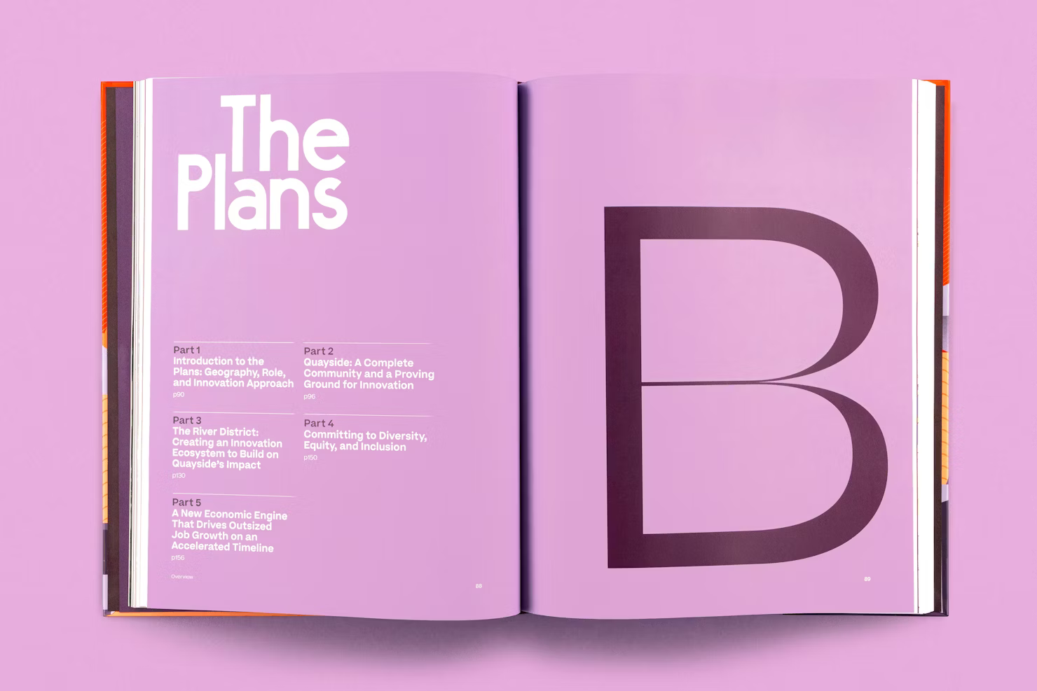
Overview volume interior spread

The contents page doubles as a colour key, teaching the four-volume system before a reader opens any chapter.
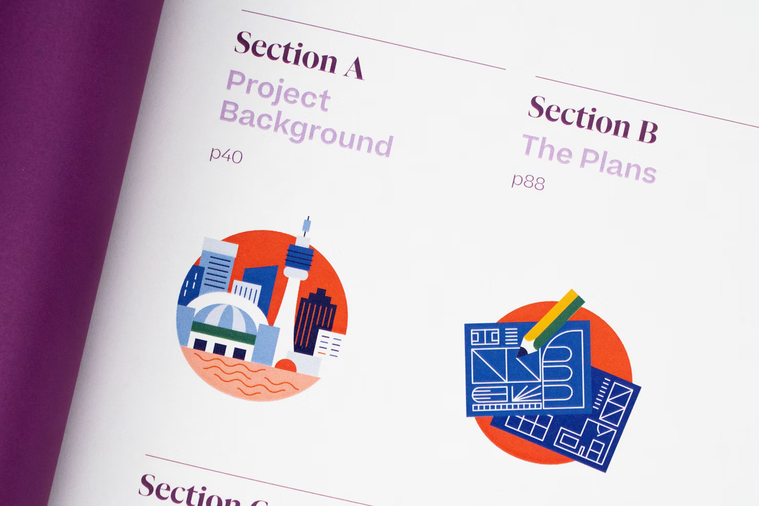
Overview volume table of contents, section dividers
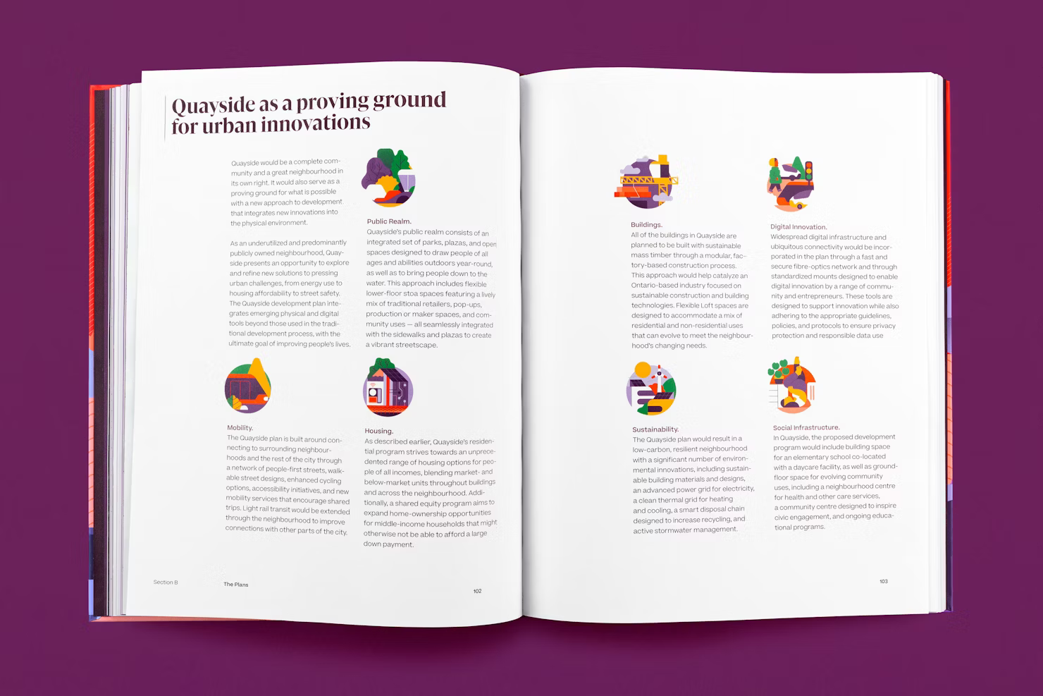
Overview volume, Quayside as a proving ground for urban innovations
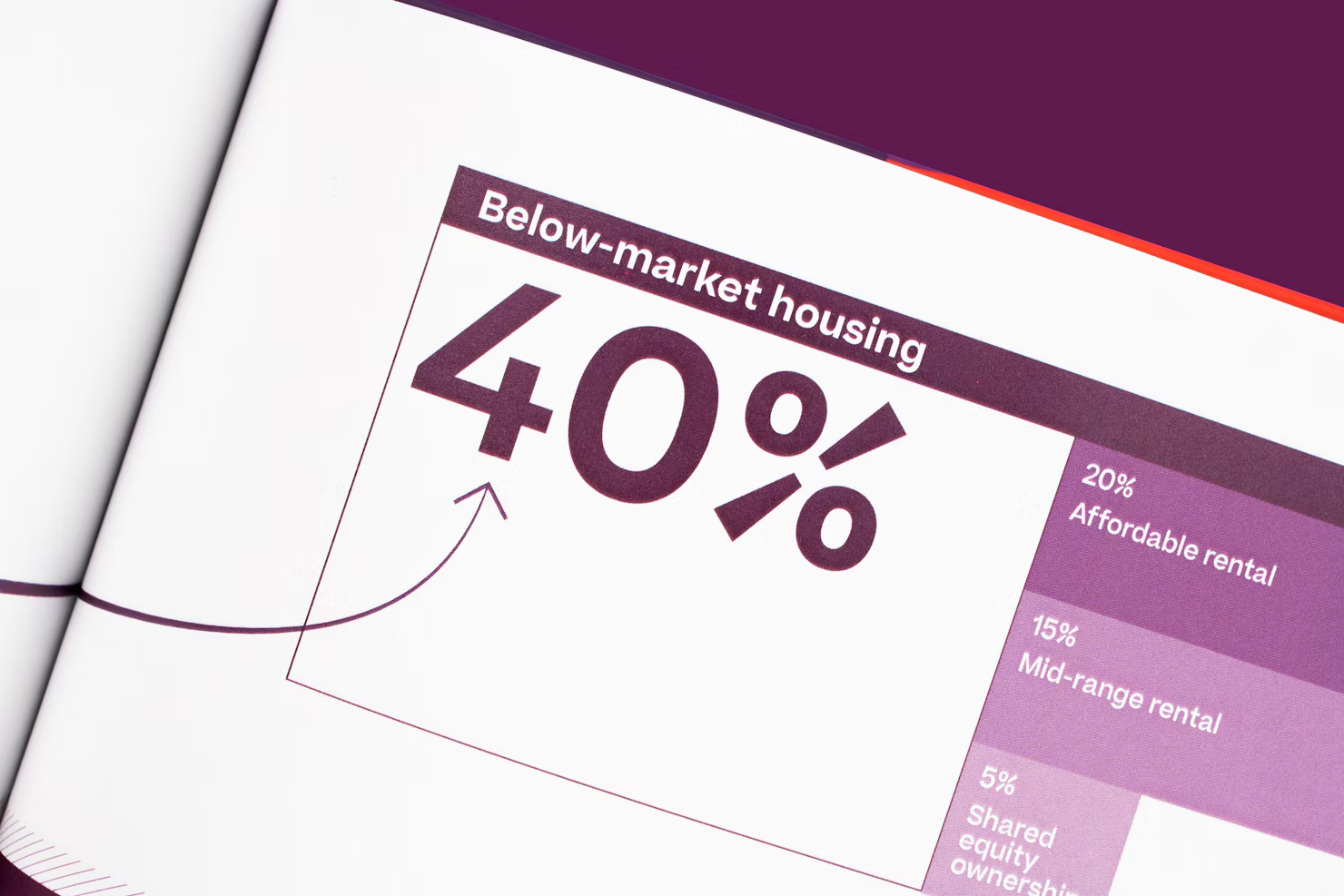
Overview volume, below-market housing callout

The 40% callout is set at diagram scale, oversized against a stacked bar broken into rental and ownership tiers below it.
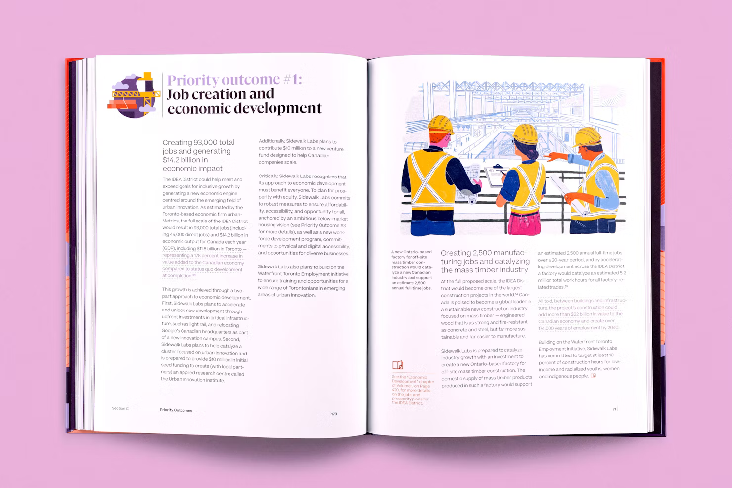
Overview volume, priority outcome one, job creation

The Plans

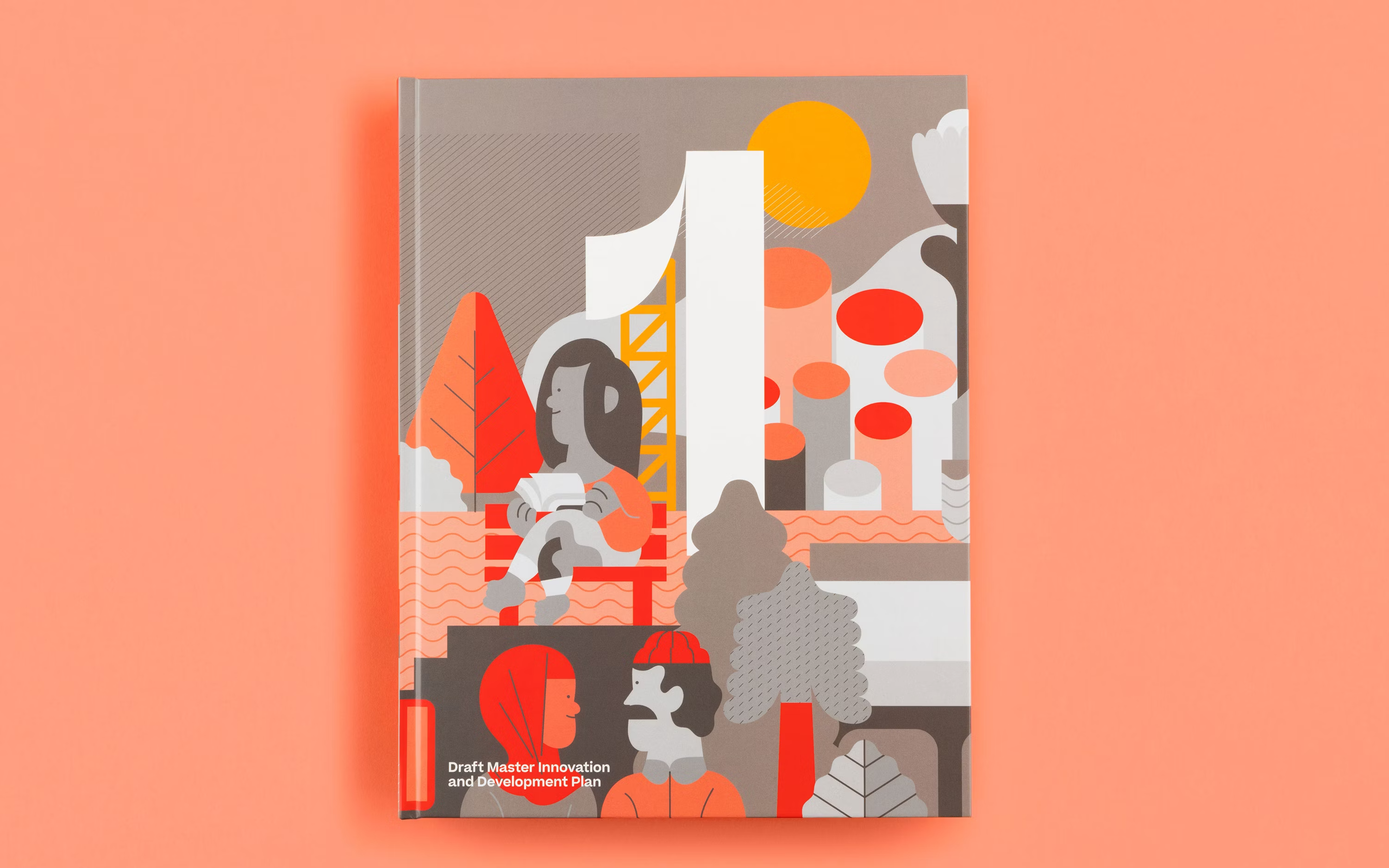
Volume 1, orange. Quayside as a proving ground, priority outcomes, and the case for tall timber construction.
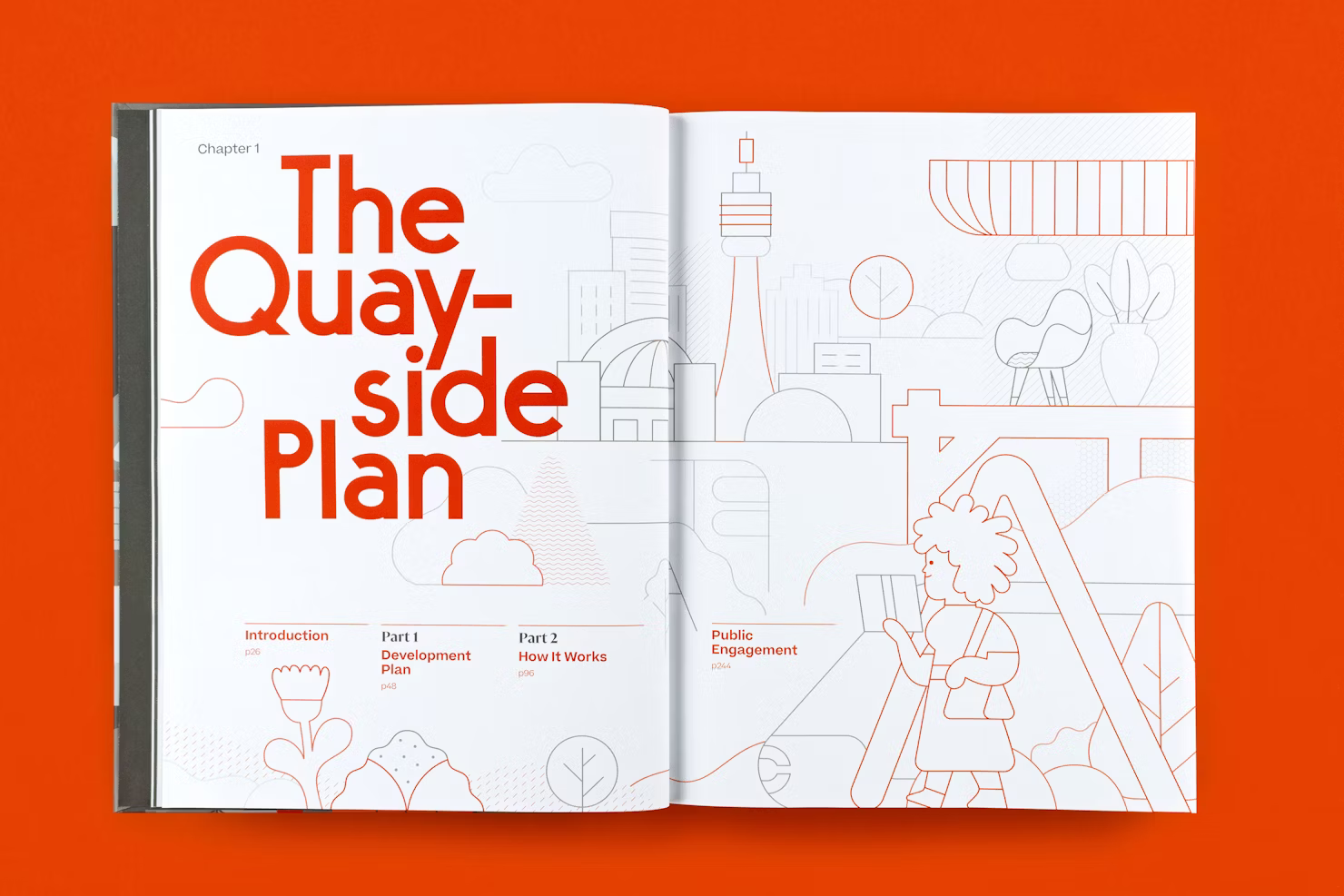
Chapter 1, The Quayside Plan, cover spread
Library of parts interpretation, Snøhetta renderings

A single hand-drawn line weight carries the whole spread, skyline and figure alike, so nothing outranks the chapter title over it.
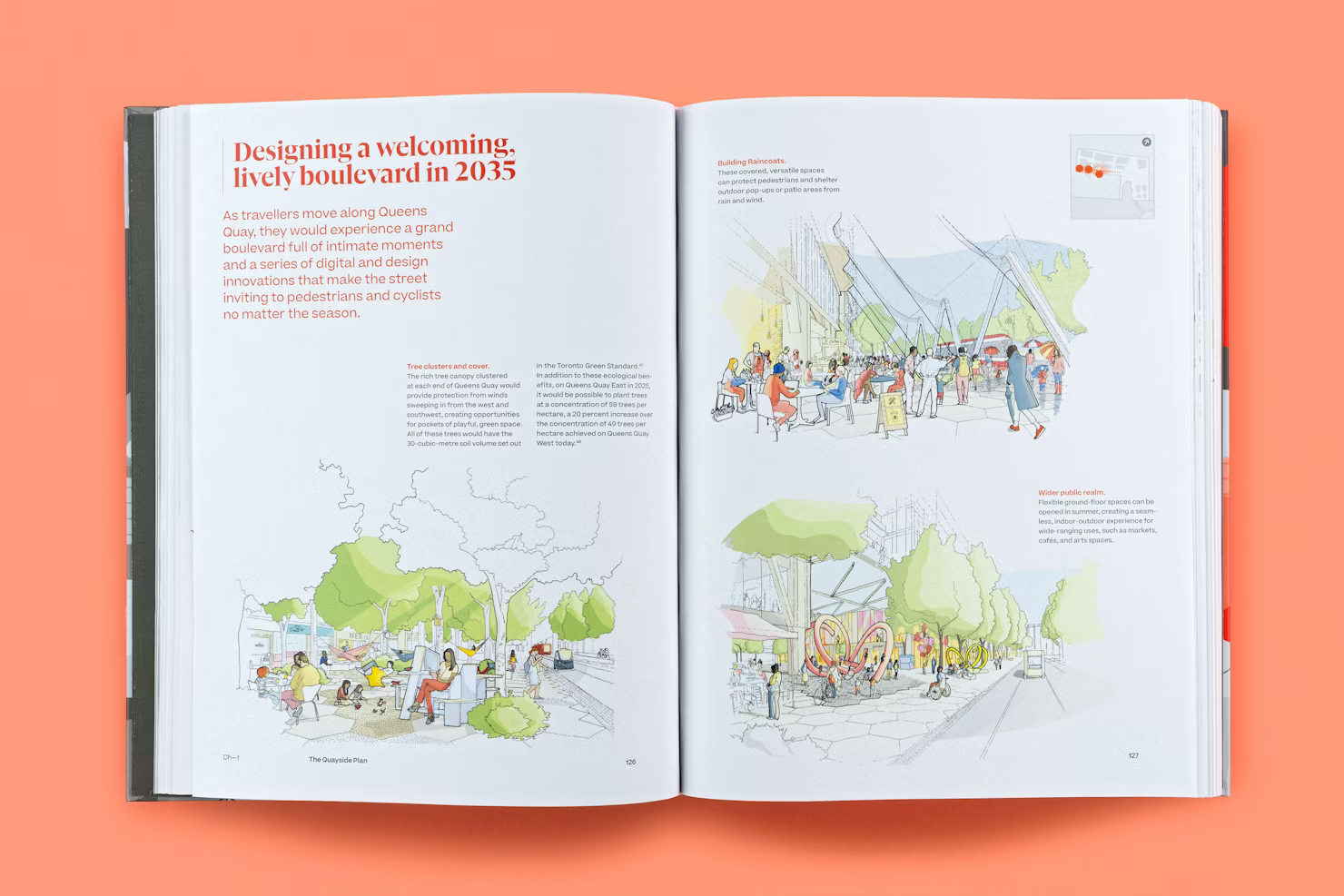
The Quayside Plan, illustrated boulevard spread

Street network reduced to line weight and colour alone, no basemap clutter competing with the hierarchy of routes.
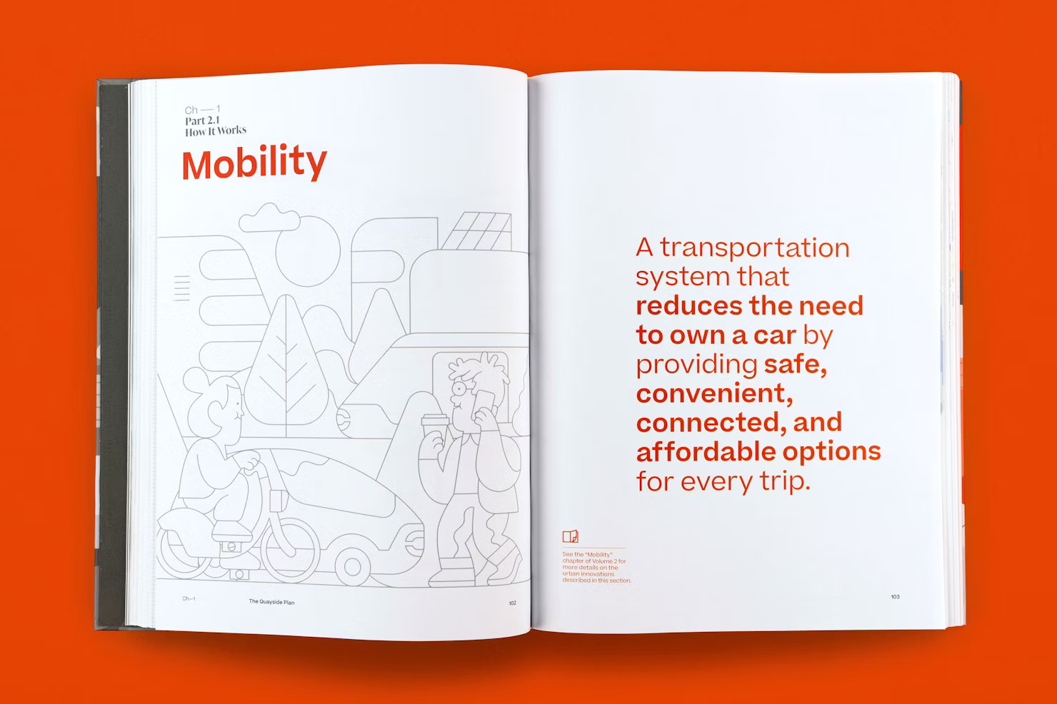
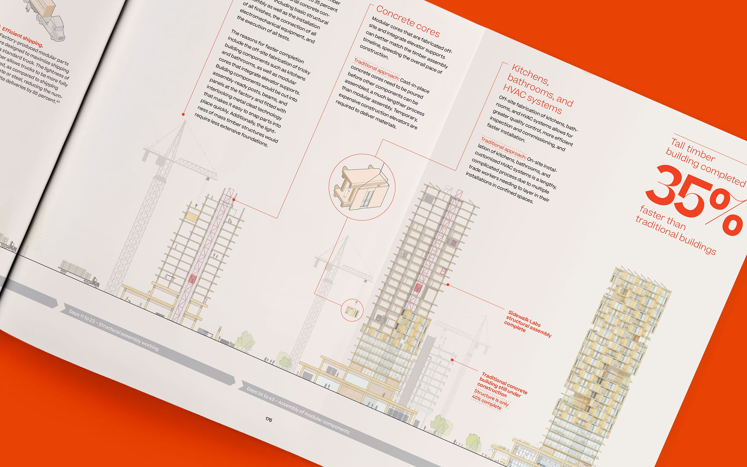
Mobility chapter, transportation diagram Tall timber construction, 35 percent faster callout
Digital innovation section icon and introduction

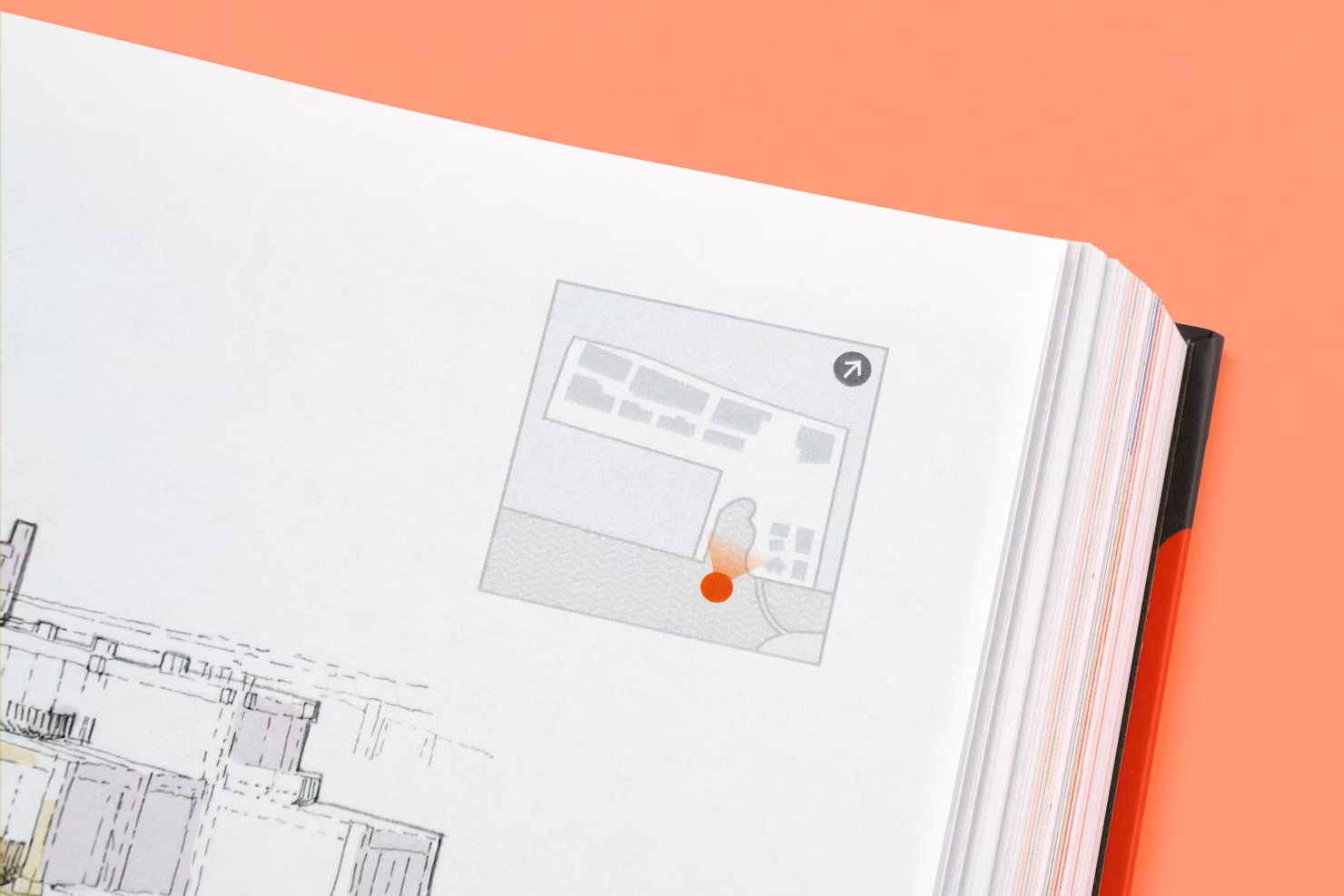
A small locator map with a dot pin, dropped into the corner of the site plan, orients the reader before the detail drawing takes over.
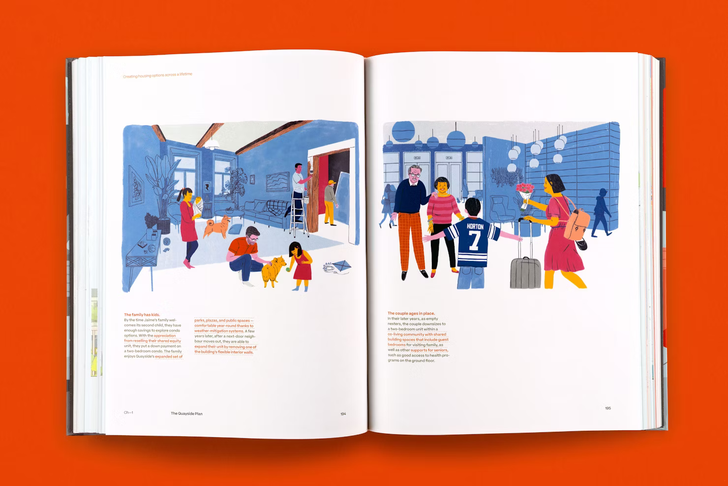
Housing options across a lifetime, illustrated spread

Urban Innovations

Volume 2, blue. Technical plates and library-of-parts systems for the public realm and mass timber construction.
Expand safe, comfortable walking and cycling networks, map spread

Isometric projection held at a shallower angle than the mobility diagrams, so transit infrastructure reads distinct from street-level plans.
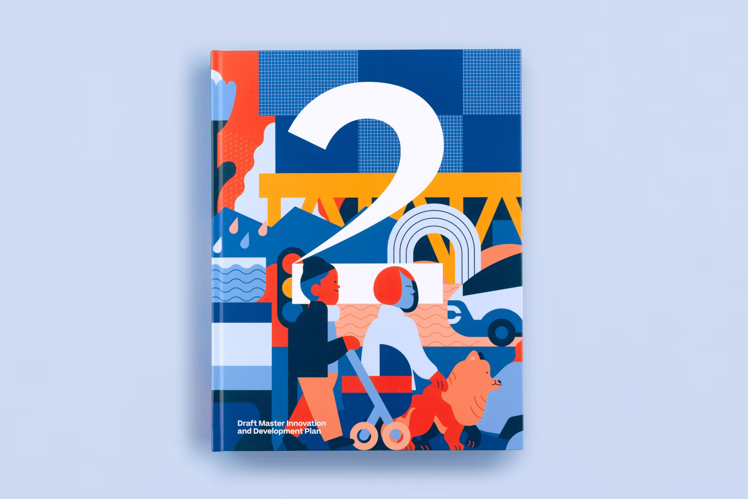
Volume 2 cover, The Urban Innovations

The volume number, a giant white "2", sits larger than the title itself, which is reduced to small type at the bottom of the cover.
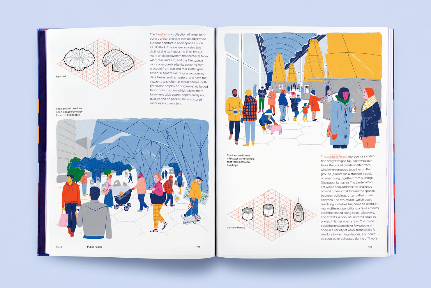
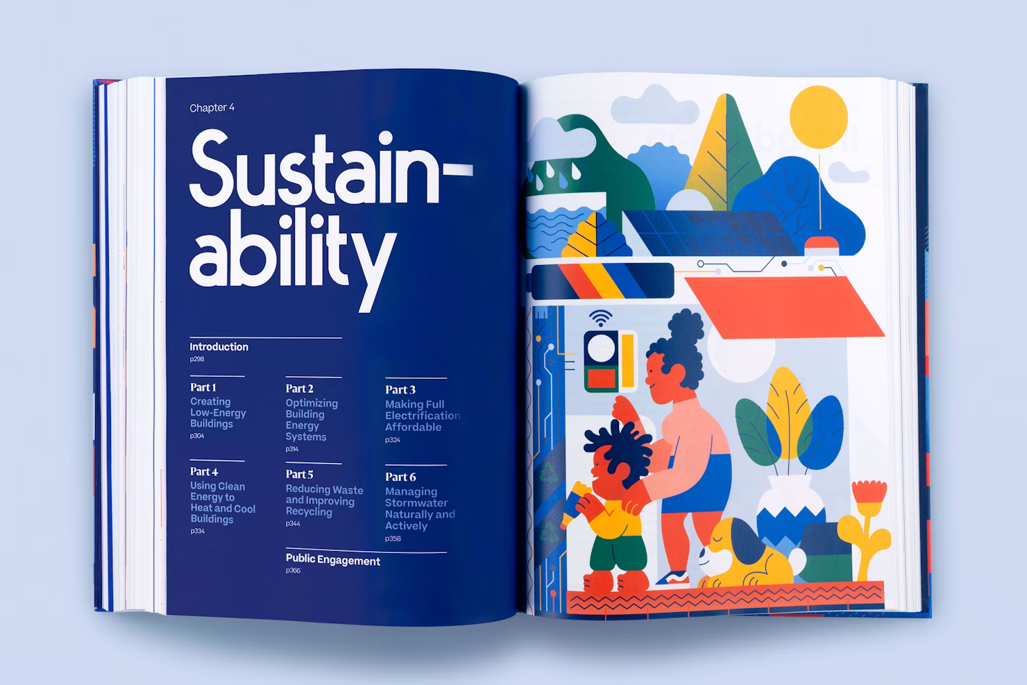
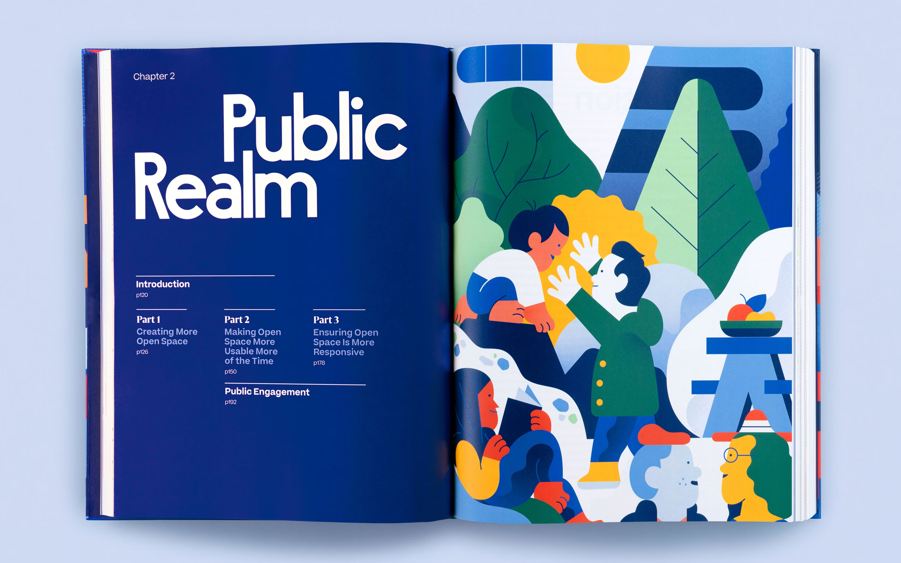
Public realm spread, Fanshell and Lantern Forest structures Transitway street type, isometric diagram Catalyzing a sustainable mass timber supply chain, illustrated spread

The Partnership

Volume 3, green. The financing volume ran as its own visual register, table-heavy and printed to signal a change of register.

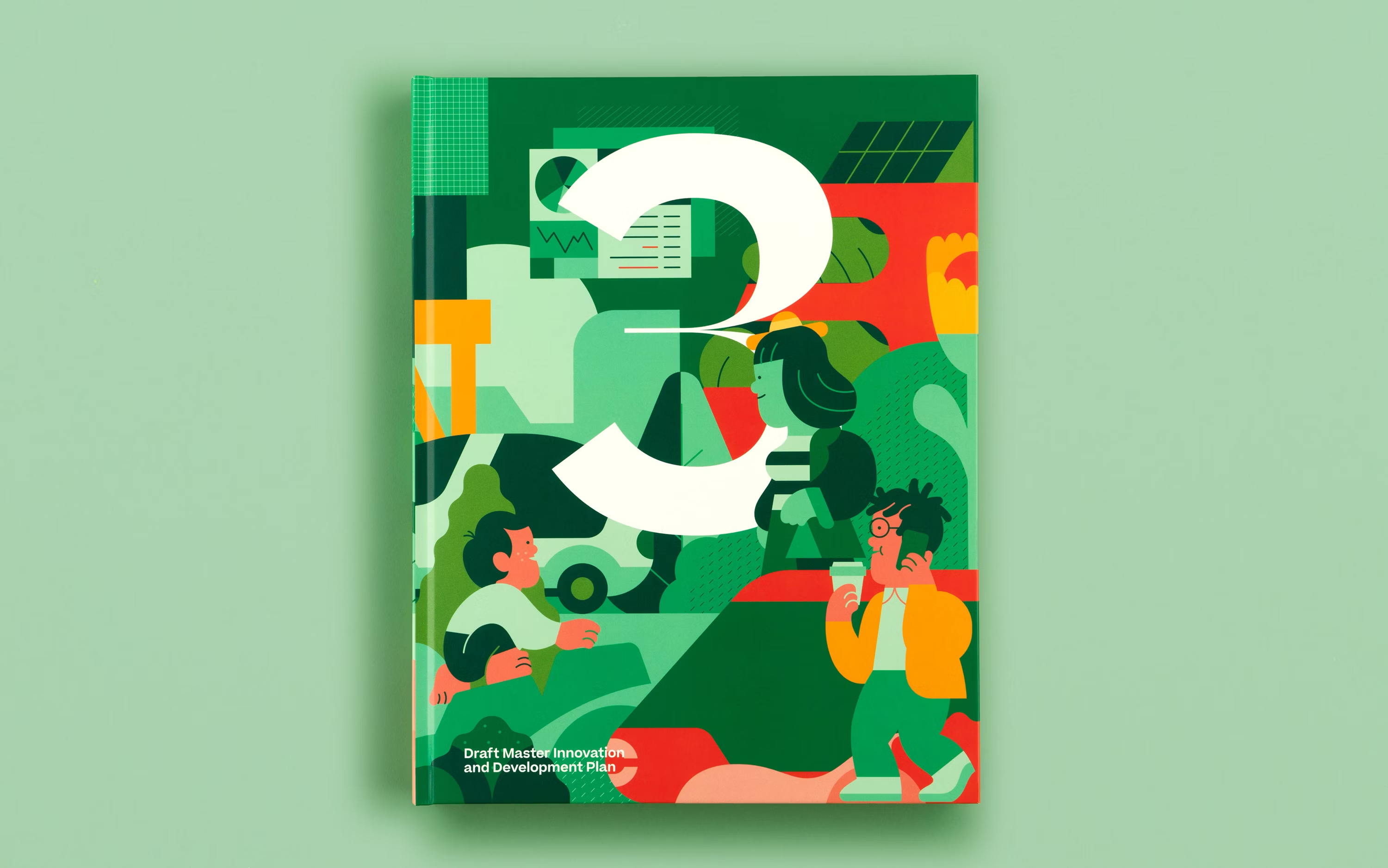
Volume 3 chapter opener, The Partnership
Volume 3 cover, The Partnership

Same system as the other covers: an oversized volume number, "3", laid over the street-scene illustration, title reduced to a caption at the bottom.
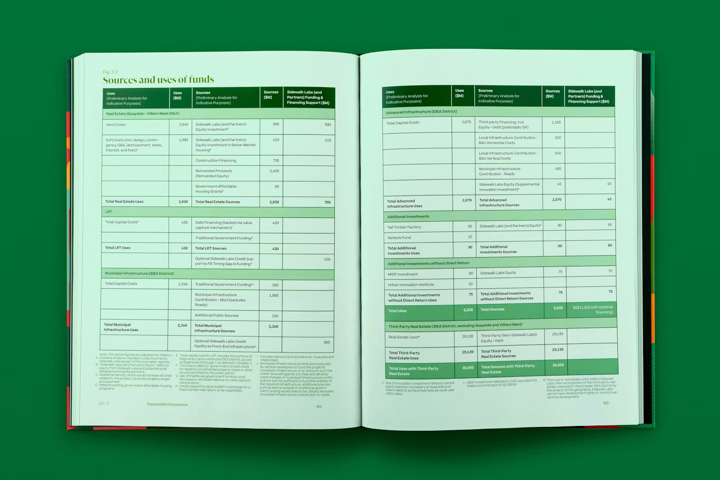
Sources and uses of funds table

Tabular type set smaller and tighter than the other volumes' body copy, a register shift that signals vision giving way to transaction.
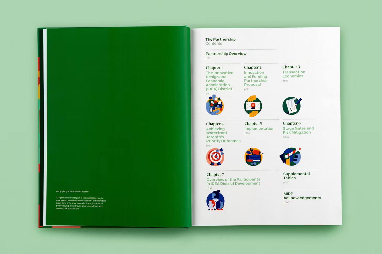
The Partnership, table of contents Proposed LRT extension by phase, map

The system

COLOUR SYSTEM, FOUR VOLUMES AND THEIR VARIATIONS

Each volume owns one core colour, and each core carries three variations used for illustration, diagrams and plan keys. Nothing crosses between families, so a reader always knows which volume a spread belongs to.

V0The Overview#601860
Illustration pink#F0A8D8
Mid lilac#D8A8D8
Deep plum#783060
V1The Plans#E84606
Plan key#FFA878
Coral#FF9078
Burnt red#C03000
V2Urban Innovations#0049A8
Pale blue#C0D8F0
Network blue#78A8D8
Deep navy#003078
V3The Partnership#007830
Mid green#A8D8A8
Positive green#009048
Forest#004818

Core colour on top, its three shades below, running light to dark.
TYPOGRAPHY
Toronto Tomorrow
Neue Droschke · David Einwaller, The Designers Foundry · book titles
An attenuated geometric grotesk with unusual offcuts.
0 1 2 3
Beatrice Display · Sharp Type · cover numerals
The quirky display cut carrying the 0–3 volume identifiers.
A city plan a city could read
Beatrice · Sharp Type · text and body
A highly readable grotesk set across 1,524 pages of technical copy.
The Urban Innovations
Gliko Modern · R-Typography · headers and pull quotes
An elegant serif for headers and pull quotes.
CONTENT TAXONOMY
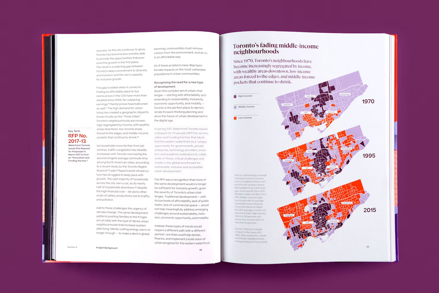
Demographic map spread, Toronto income distribution by neighbourhood
M1 · Demographic map
[Type][Scale], [Role] P Photography · M Map · C Chart · D Diagram · X Technical · I Icon · IL Illustration
V0 The Overview V1 The Plans V2 Urban Innovations V3 The Partnership
PRIMARY
STRUCTURAL
SUPPORTING
IL1Volume cover illustration system
The four wraparound narrative landscapes that create the slipcase panorama.
IL1Chapter numeral illustrations (0–3)
Full-bleed figures integrated with environment, acting as volume identifiers.
D1Full-spread system diagrams
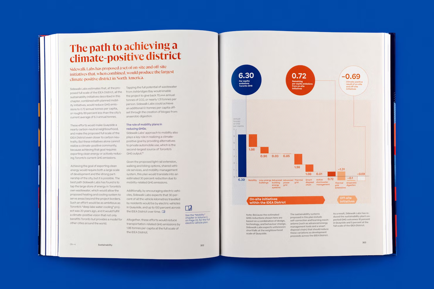
Large angled linework diagrams introducing major sections.
M1Full-spread demographic maps
Three stacked Toronto income distribution maps (1970 / 1995 / 2015).
P1Full-spread portrait photography
Black-and-white opening portraits with eyes closed.
IL2Section vignette illustrations
Circular program icons, mobility, housing, sustainability.
D2Policy flow diagrams
Multi-node system diagrams embedded within text pages.
C2Key metric callout charts
Large percentage callouts, e.g. 40% below-market housing.
X2Library of parts technical plates
Snøhetta mass timber toolkit layouts with multiple image panels.
M2Mid-size site maps
Inset Quayside planning maps within policy text.
C3Data bars and stacked outcome charts
Small comparative bars in the outcomes section.
D3Detail system schematics
Small line diagrams embedded within paragraphs.
I3Program pictograms
Single-colour icons used in navigation and key terms.
P3Supporting architectural photography
Inset building images within technical spreads.
X3Detail technical callouts
Small annotated construction details.

“Design is the difference between a plan that sits on a shelf and one that changes a city.”

The activation
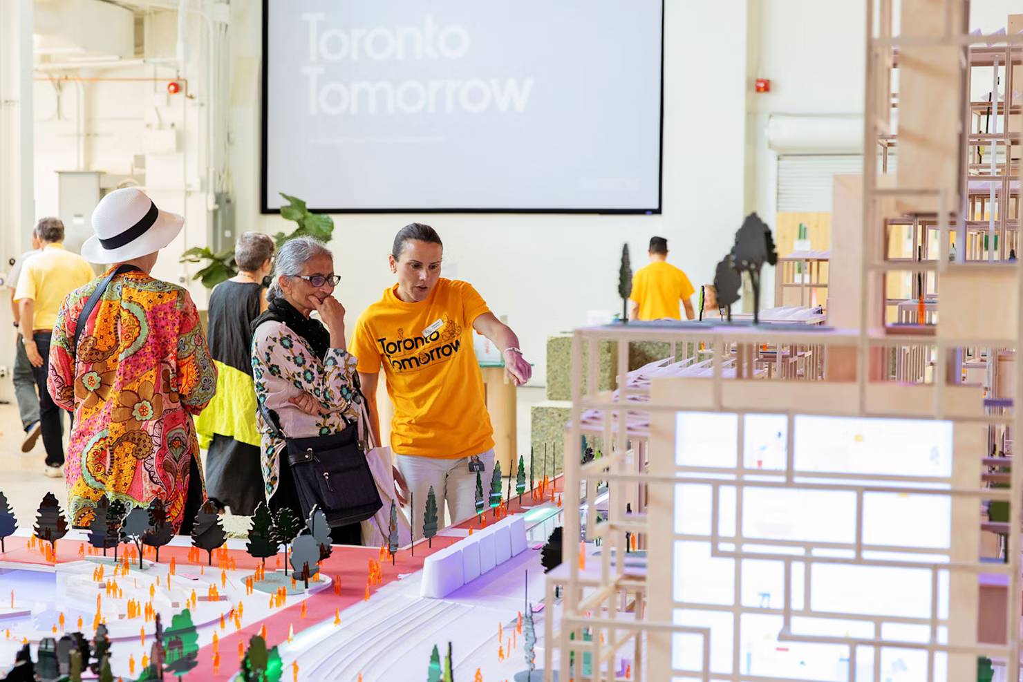
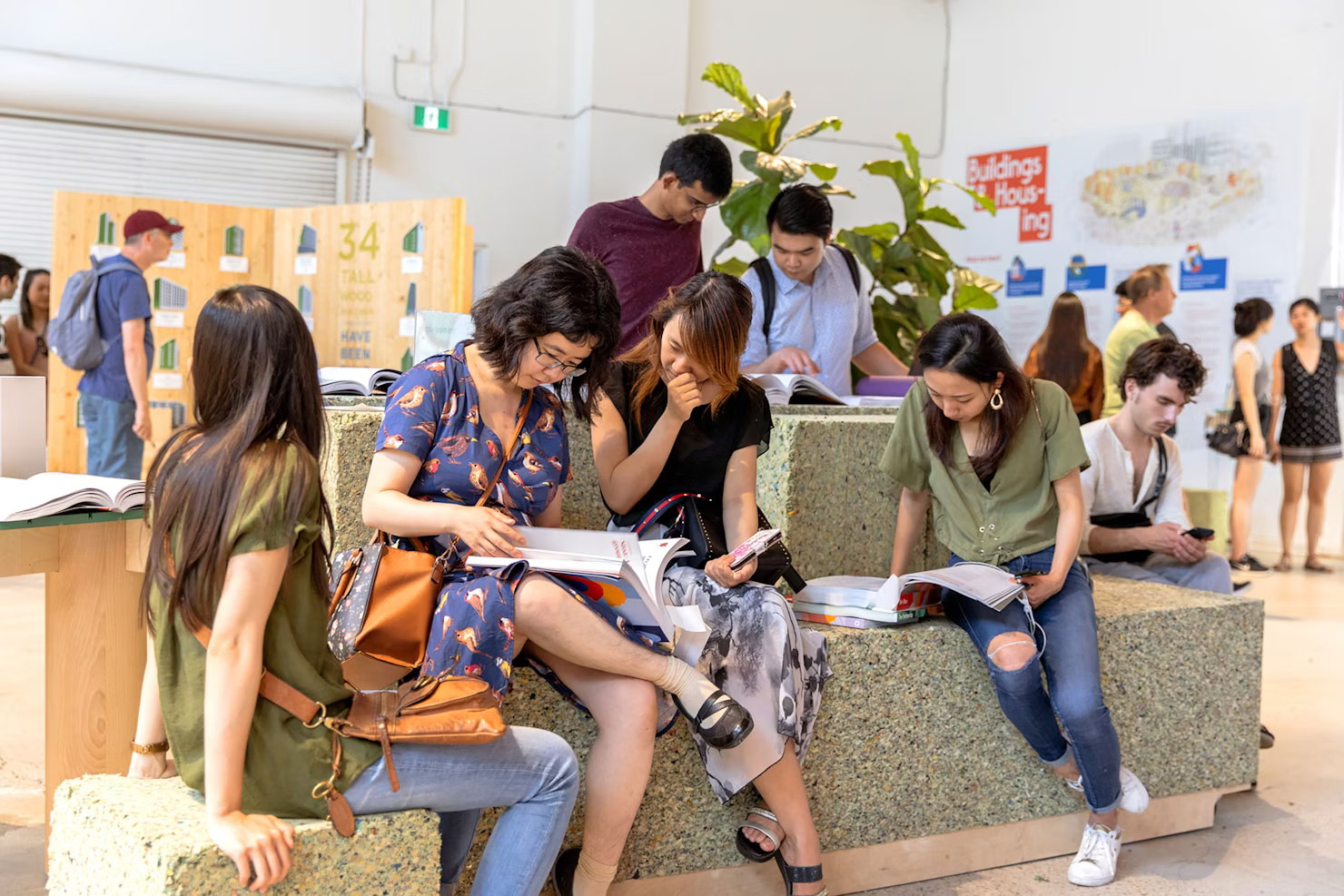
307 Lake Shore exhibition, opening week Visitors reading the printed volumes at the exhibition

Thousands of portfolios were reviewed and twenty designers interviewed to build a four-person craft team, a typographer, a cartographer, an architectural illustrator, and a generalist, against the gaps the content architecture exposed. Design worked directly with policy, engineering, and product leads in daily stand-ups so every chapter was reviewed by the people accountable for its content. An outside production partner carried the system to print, briefed and reviewed so the visual language held identically across all four books.

Toronto Tomorrow became a benchmark for smart-city design and urban-systems storytelling, and is used as a teaching reference at Harvard.


PRODUCTION
FORMAT
Four volumes in one slipcase
CASE
Grey coated linen, silver foil debossed title
COVERS
Wraparound artwork, one interconnected scene
SPINES
A dedicated colour per volume, 0–3
INTERIOR
Gatefolds open the plans to full width
WAYFINDING
Layered navigation for a dense book
COLLATERAL
Exhibition panels, plates, tote and apparel
PRINT
Preflight, prepress, colour proofs in-house
ILLUSTRATION AND PHOTOGRAPHY
Hedof: illustration system across covers, dividers, totes.
Emily Taylor: atmospheric gatefolds.
mgmt.: infographics.
Rich Gilligan: opening portraits, with Mission Photo Production.
MORE WORK
We design brands for ambitious companies.
Sidewalk Infrastructure Partners Upgraid Cavnue Hot Drops Twisted Dough Office Design Court of Master Sommeliers