A fermented hot sauce built to enhance a dish, never dominate it.
Hot sauce branding runs on flaming skulls, aggressive type and hyperbolic slogans. Founder Leigh Whiting and her brother started Hot Drops during the pandemic, and it had to be clean, elegant, funny, and still unmistakably hot. A probiotic, lacto-fermented sauce competes on flavour and fermentation rather than threat level, which meant signalling quality without turning clinical.
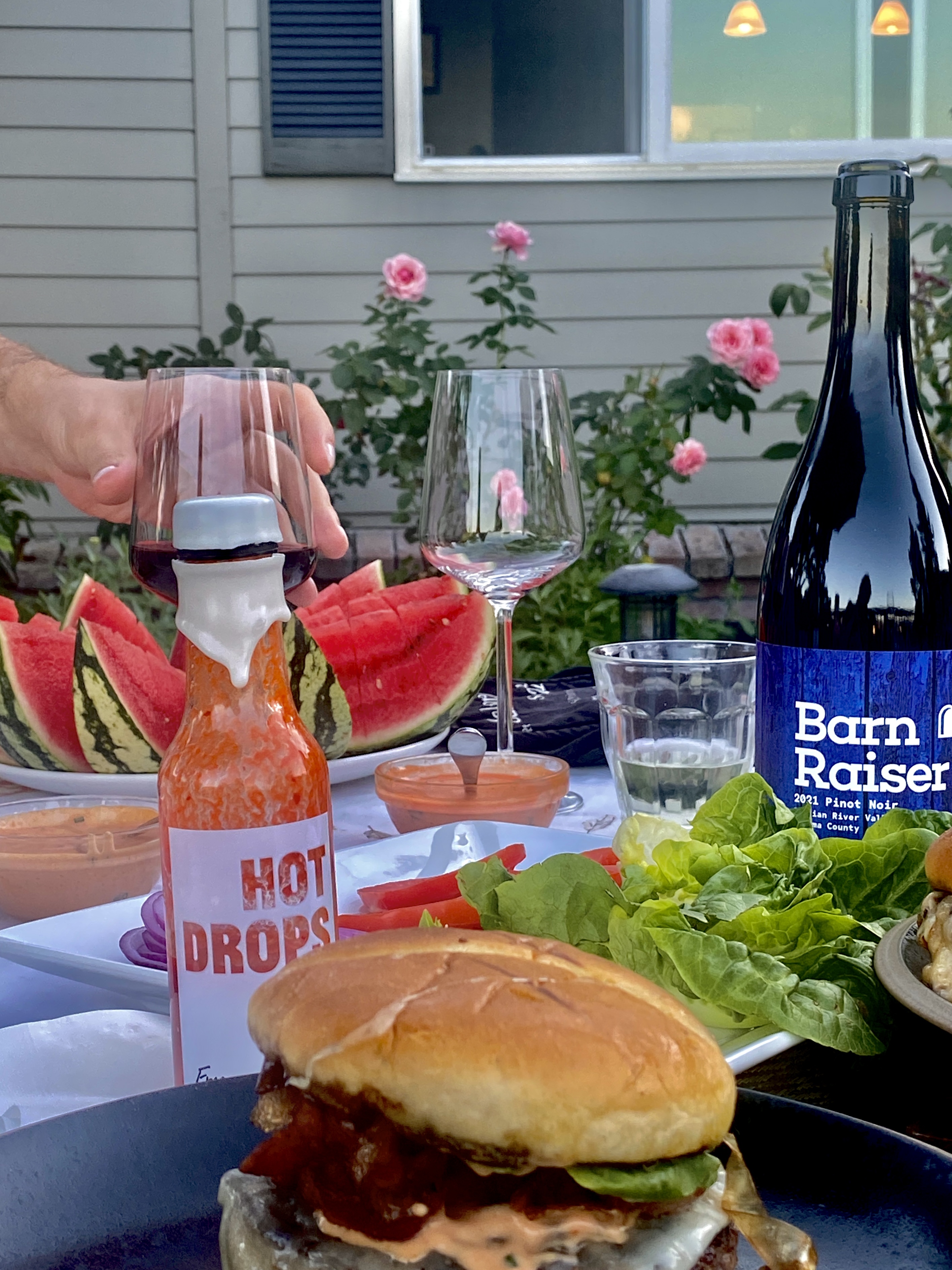
Almost nothing in the category is aimed at the women who buy most of it. That decided the brand: clean lines, elegant type and food-forward photography, not the heat-as-threat register the shelf runs on. Every pour in every film is a woman's hand.
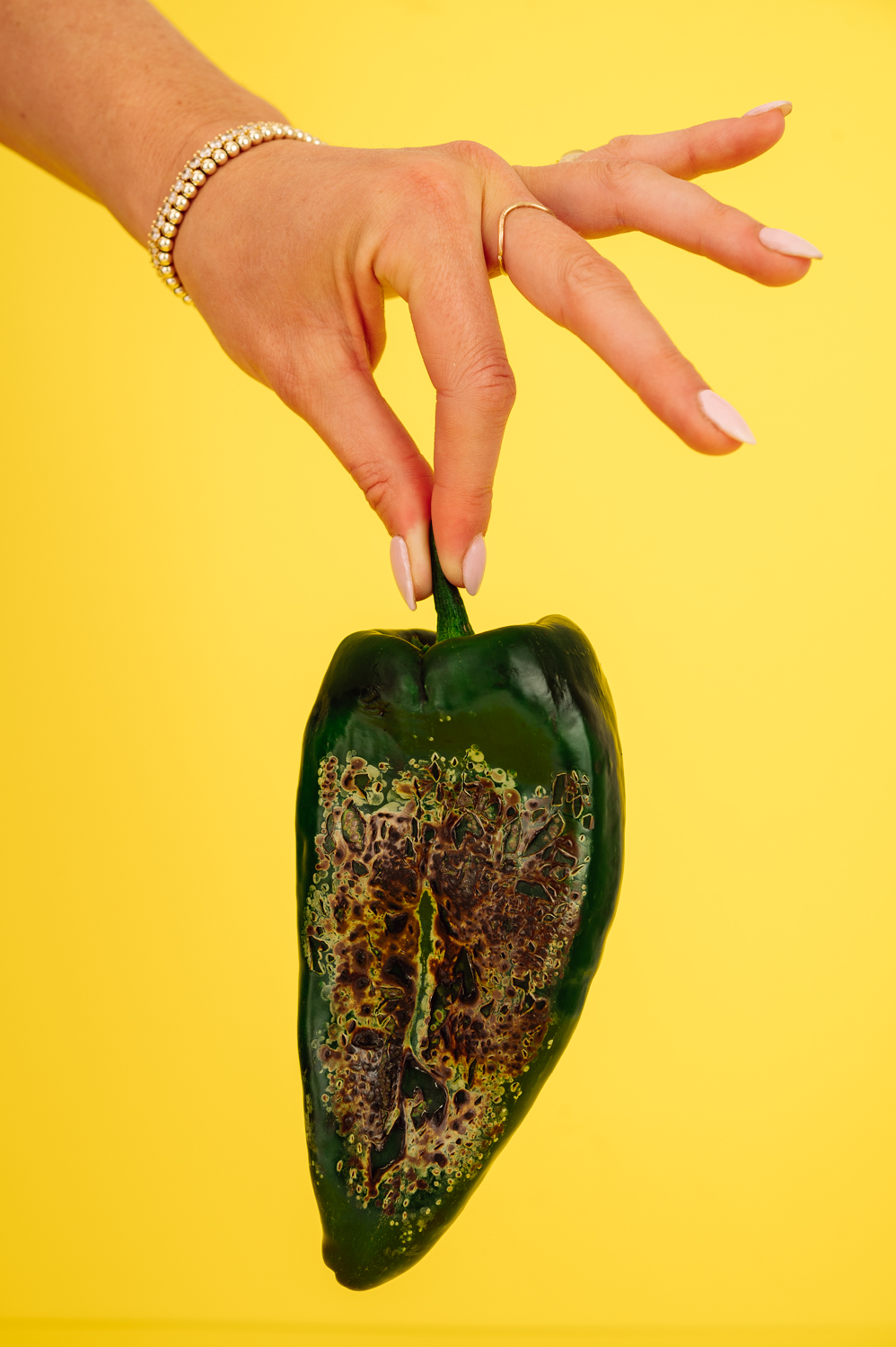
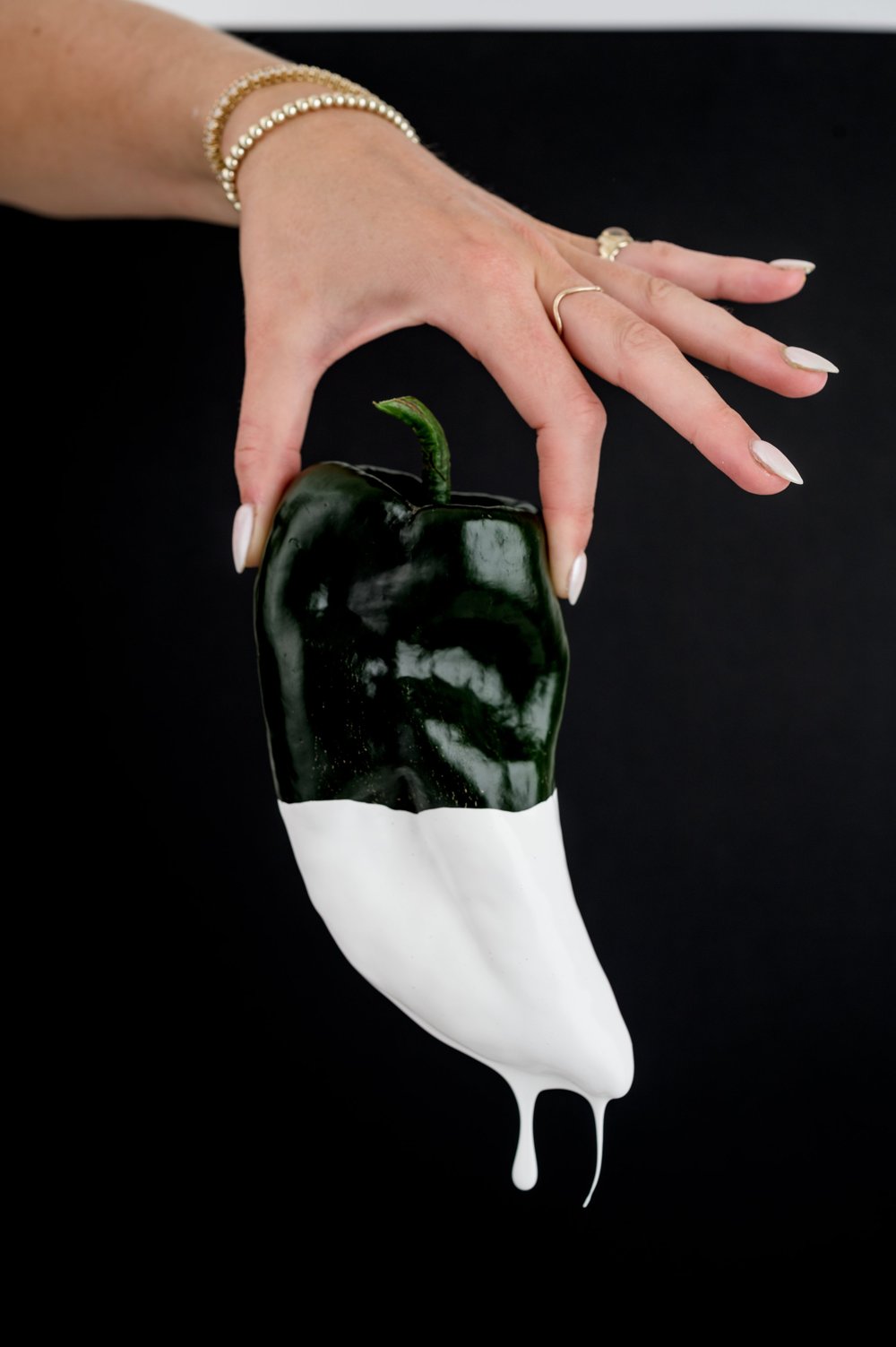
STUDIO•US directed and modelled the photography, flooding each flavour colour behind the raw ingredients until every scene doubles as a swatch.
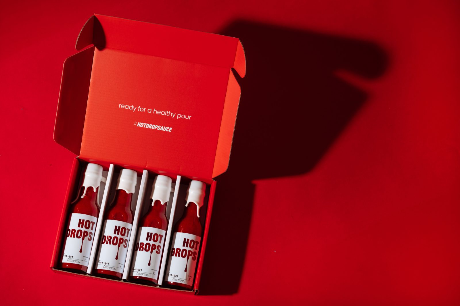
Packaging
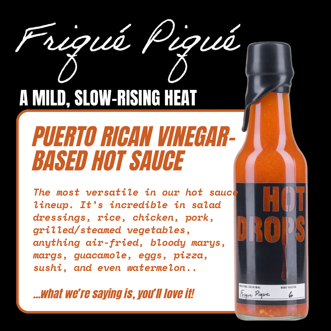
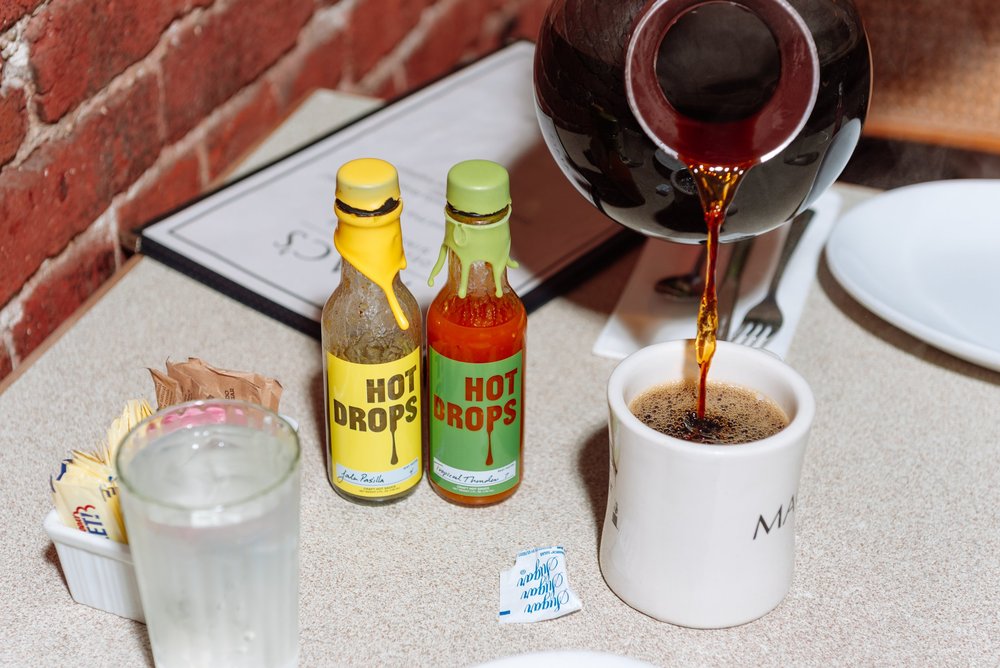
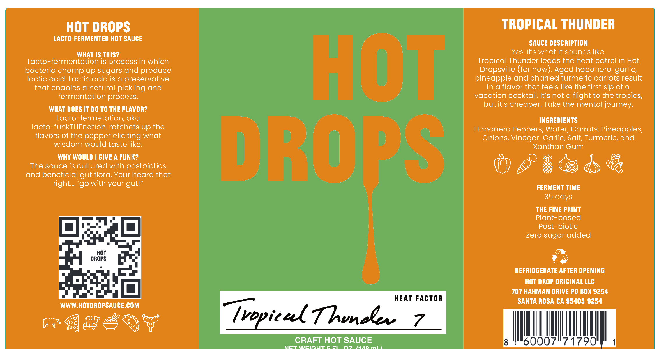
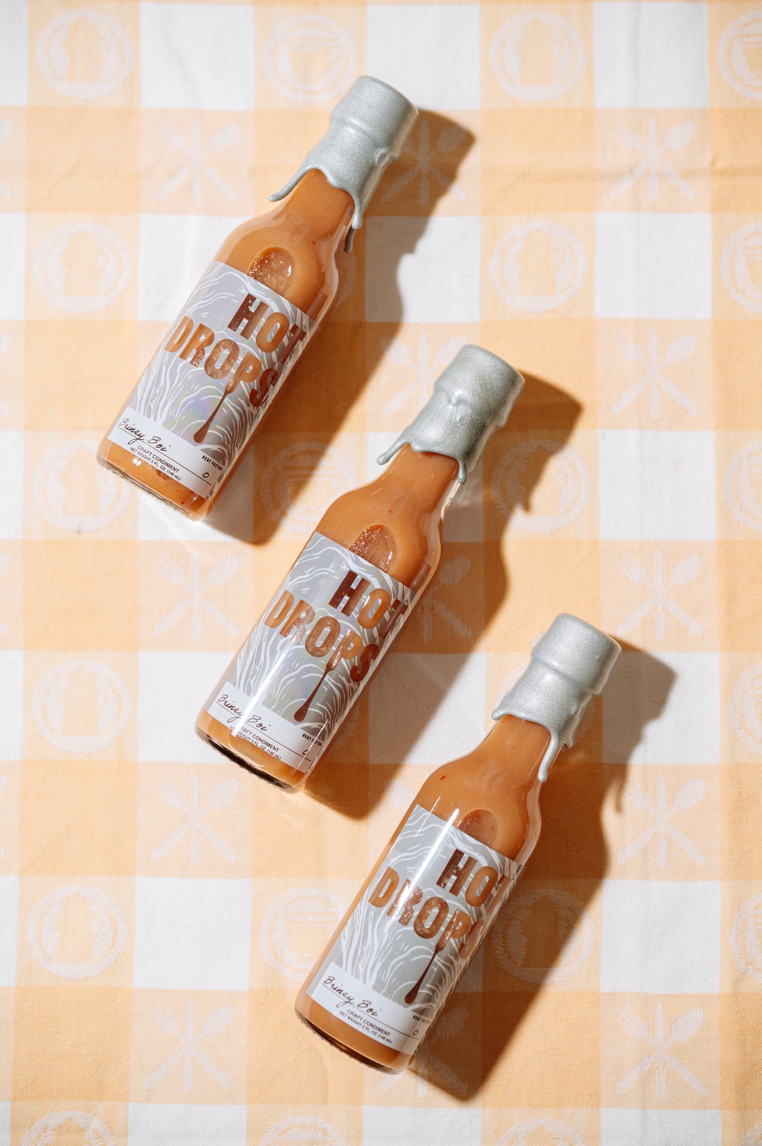
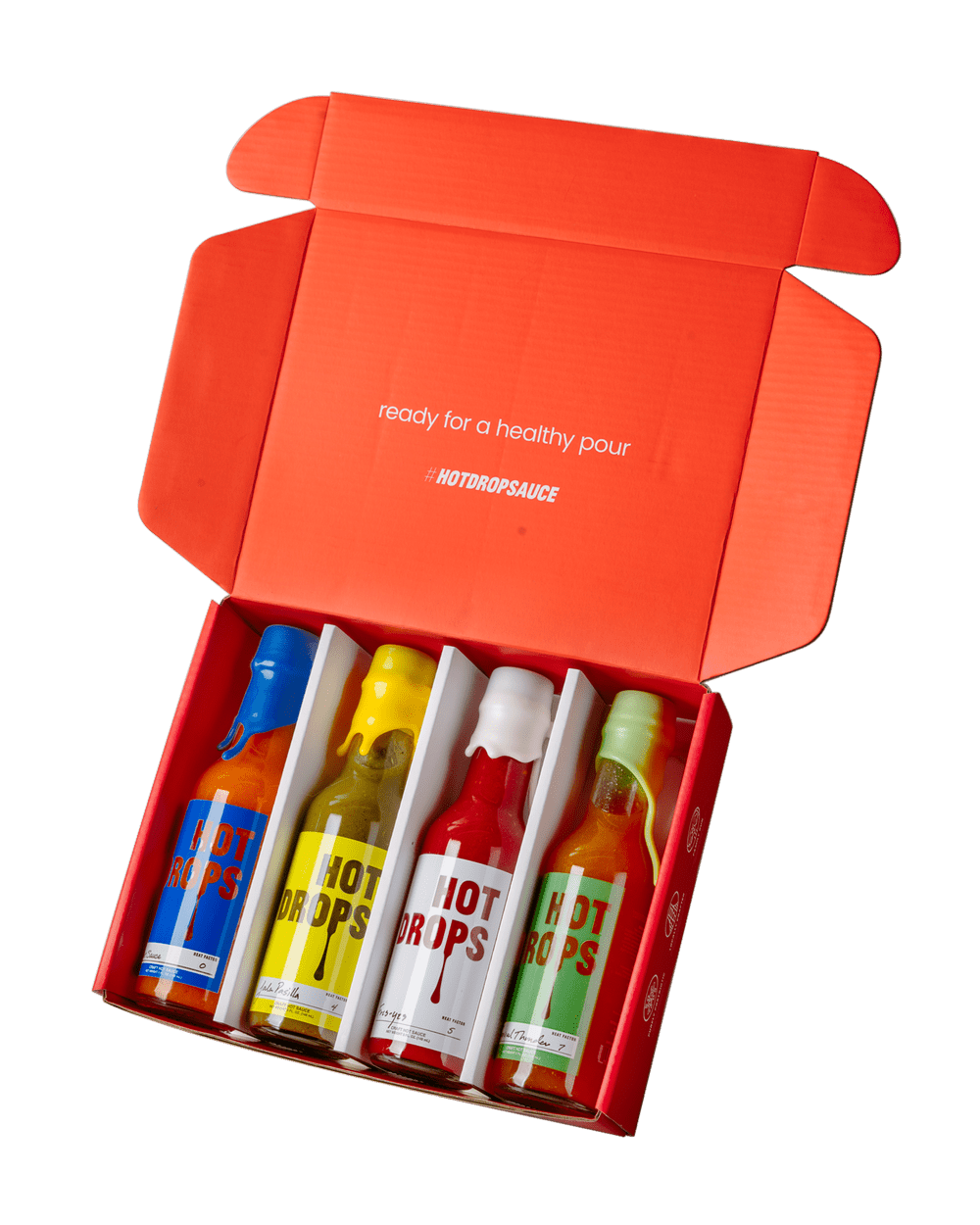
Each label colour comes straight off the sauce in the bottle, from Jala Pasilla's charred poblano yellow to Tropical Thunder's aged-habanero green, so a shopper reads heat and profile before they read a word. Not Sauce breaks the rule on purpose, carrying no heat and a cobalt no chile makes.
Three typefaces split the work. Benoît Bodhuin’s Jean Luc Bold sets the HOT DROPS logotype, expressive enough to read premium and odd enough to stay funny. Flavour names are drawn from the founder’s own handwriting, the same hand that signs the mailer, the thank-you card and the site. Poppins carries ingredients, heat scales and everything else without competing with the colour behind it.
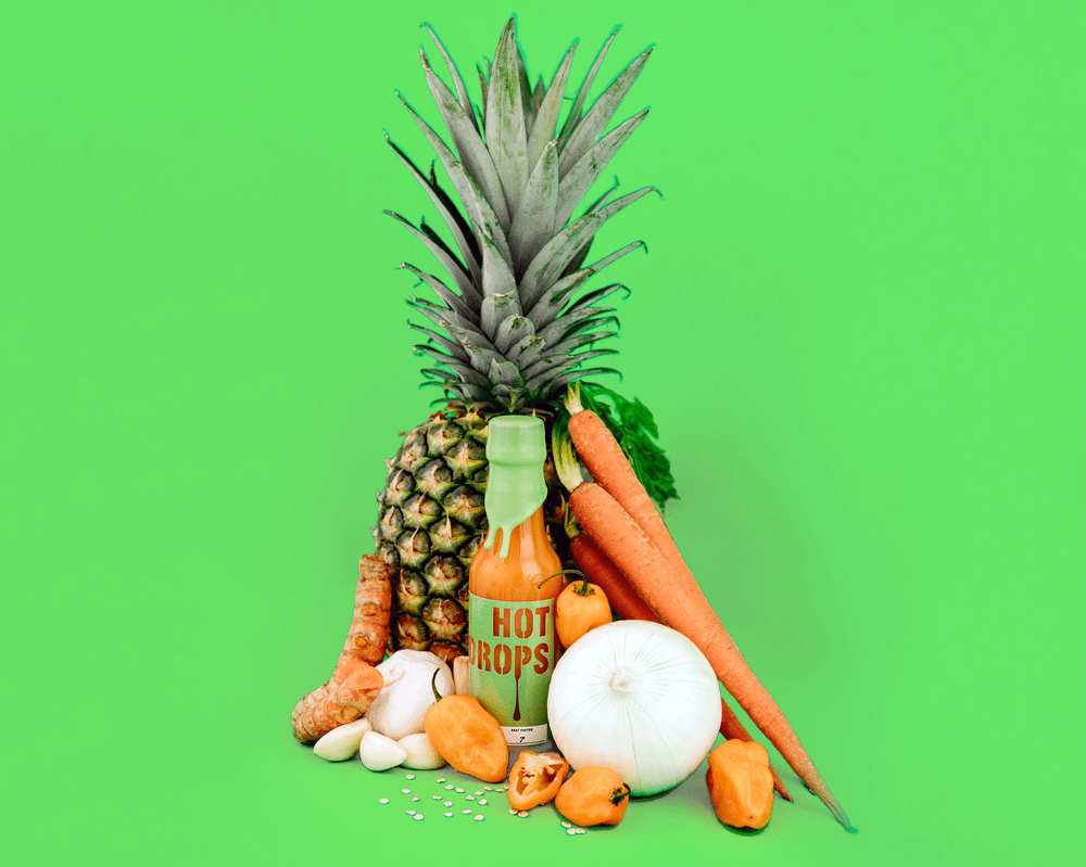
The sauce's own colour becomes part of the palette here. The aged-habanero green isn't a backdrop added in post, it's the same green the label carries.
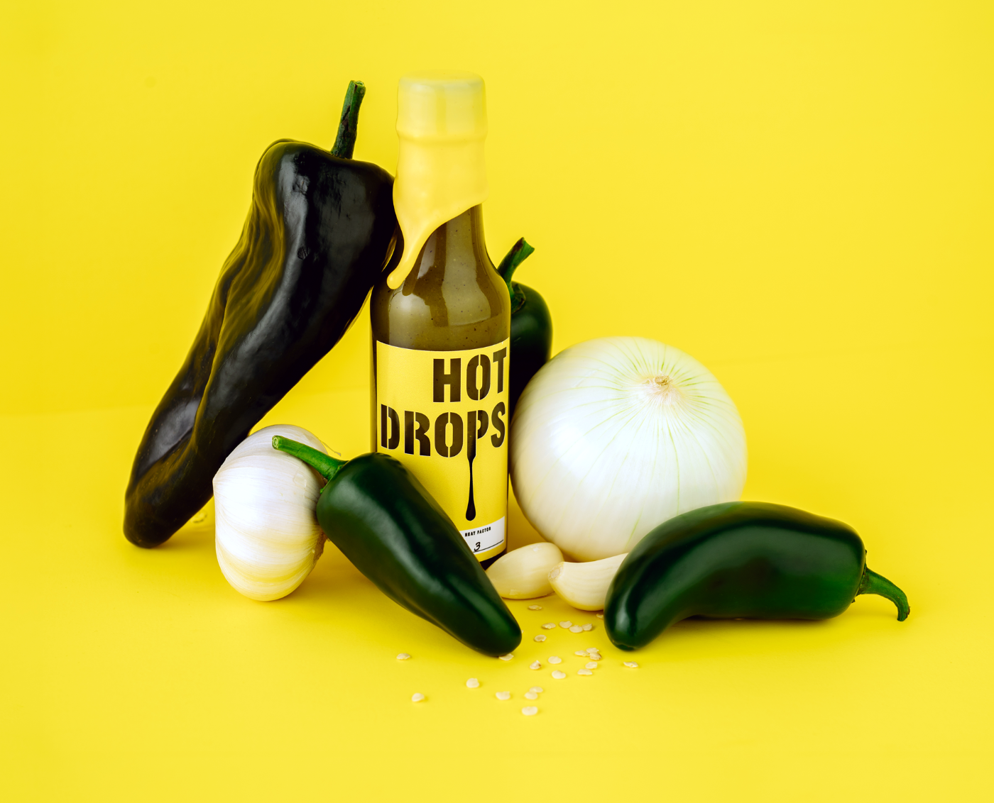
Every ingredient shot doubles as a swatch, the flavour colour flooding the scene behind the raw peppers.
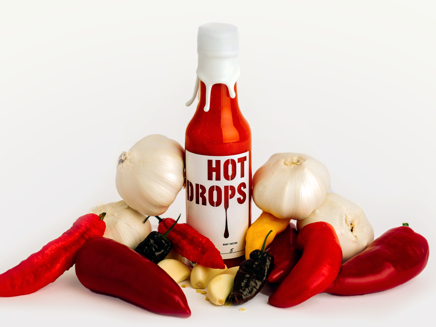
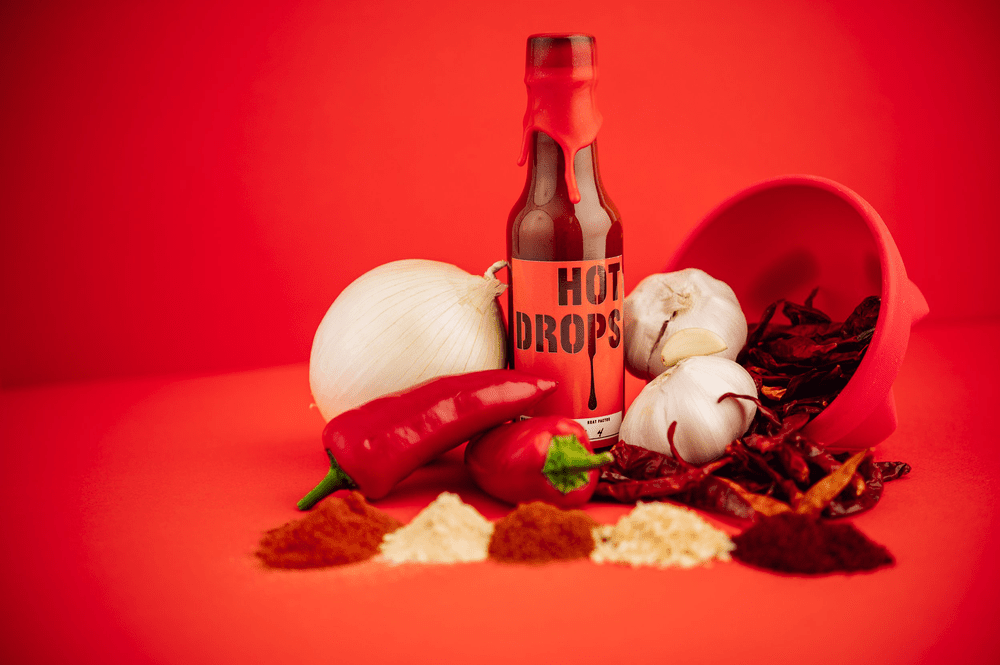
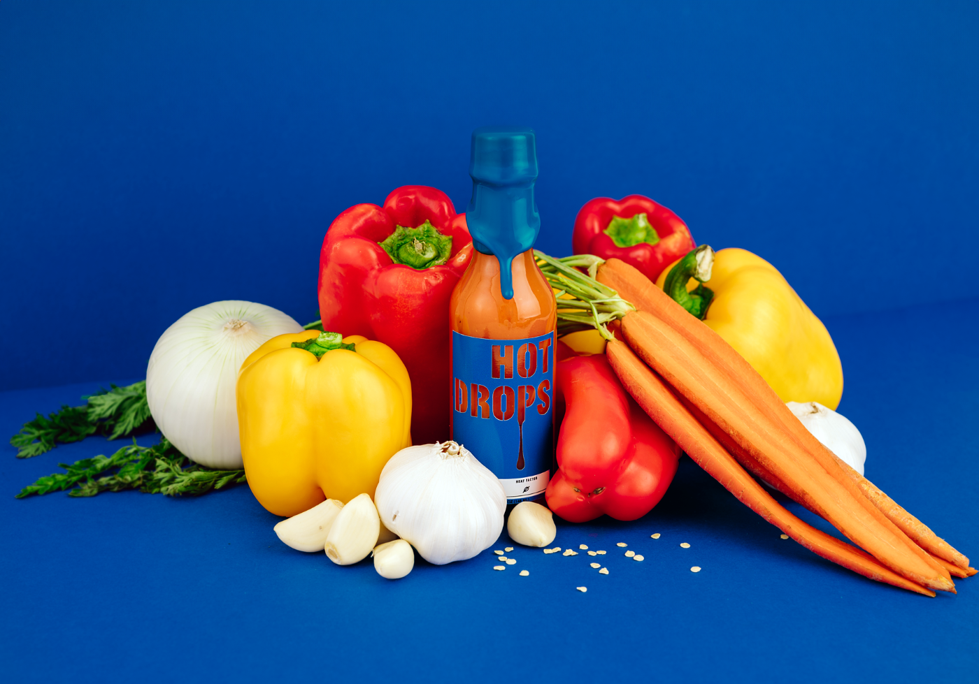
Not Sauce carries no heat, so the cobalt behind it reads as the deliberate outlier on the shelf.
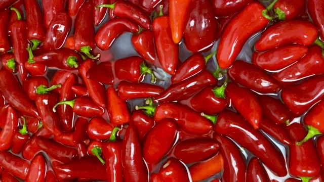
Peppers are brined and left to ferment before a bottle is ever filled.
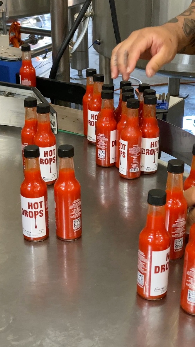
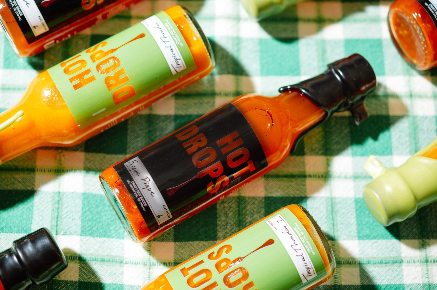
Filled, labelled and packed by hand on a short line, so the identity had to survive a wet bottle under shop lights, not just studio light.
The mailer
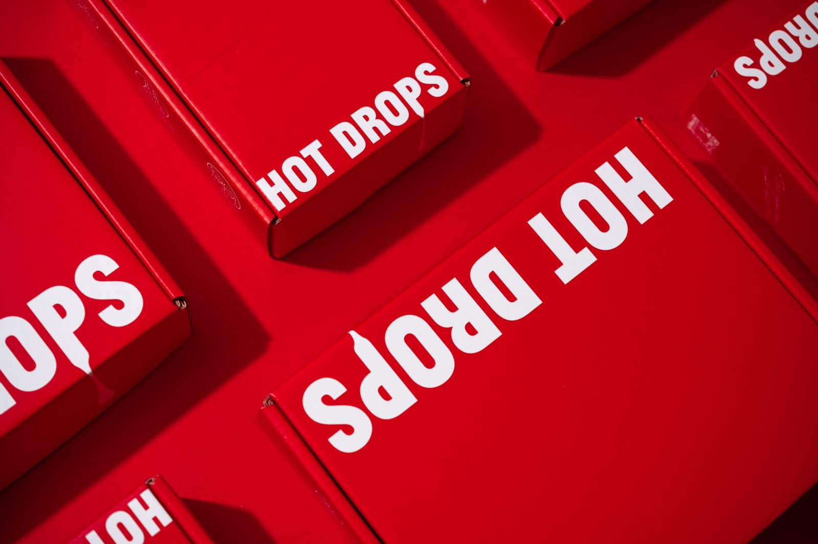
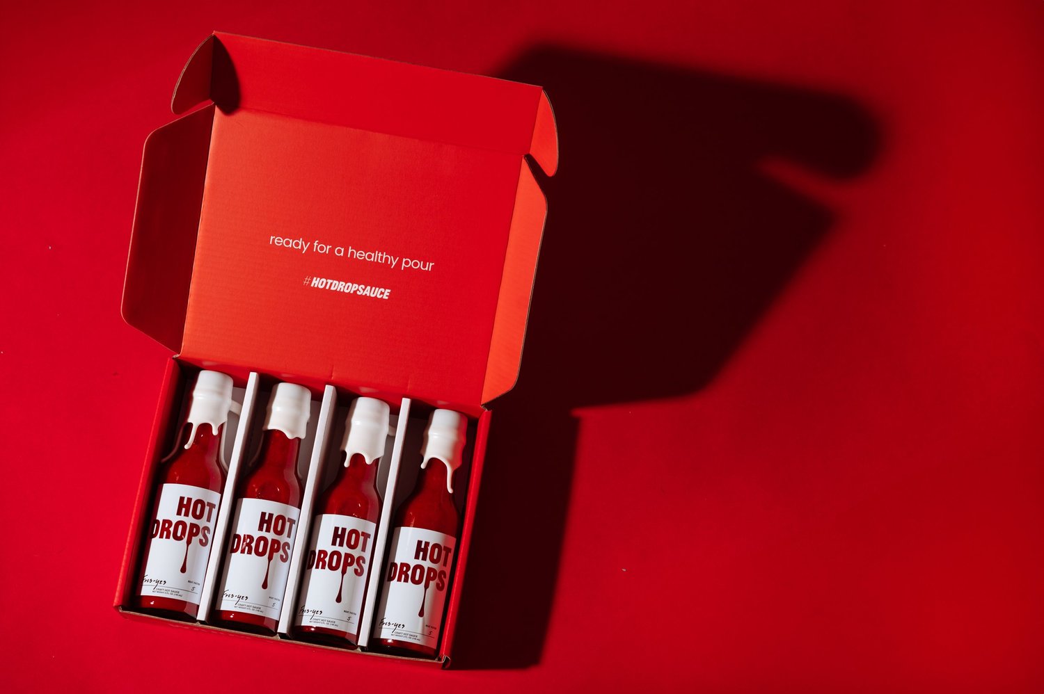
A dieline built for a variety-pack unboxing moment. The drip motif carries around the front edge of the box, so the mark arrives before the box is even open, and every flap earns its space: three icons for the brand claims, a QR code paired with “ready for a healthy pour?”, and the URL set upside down on the bottom flap so it lands right-way-up as the box comes apart.
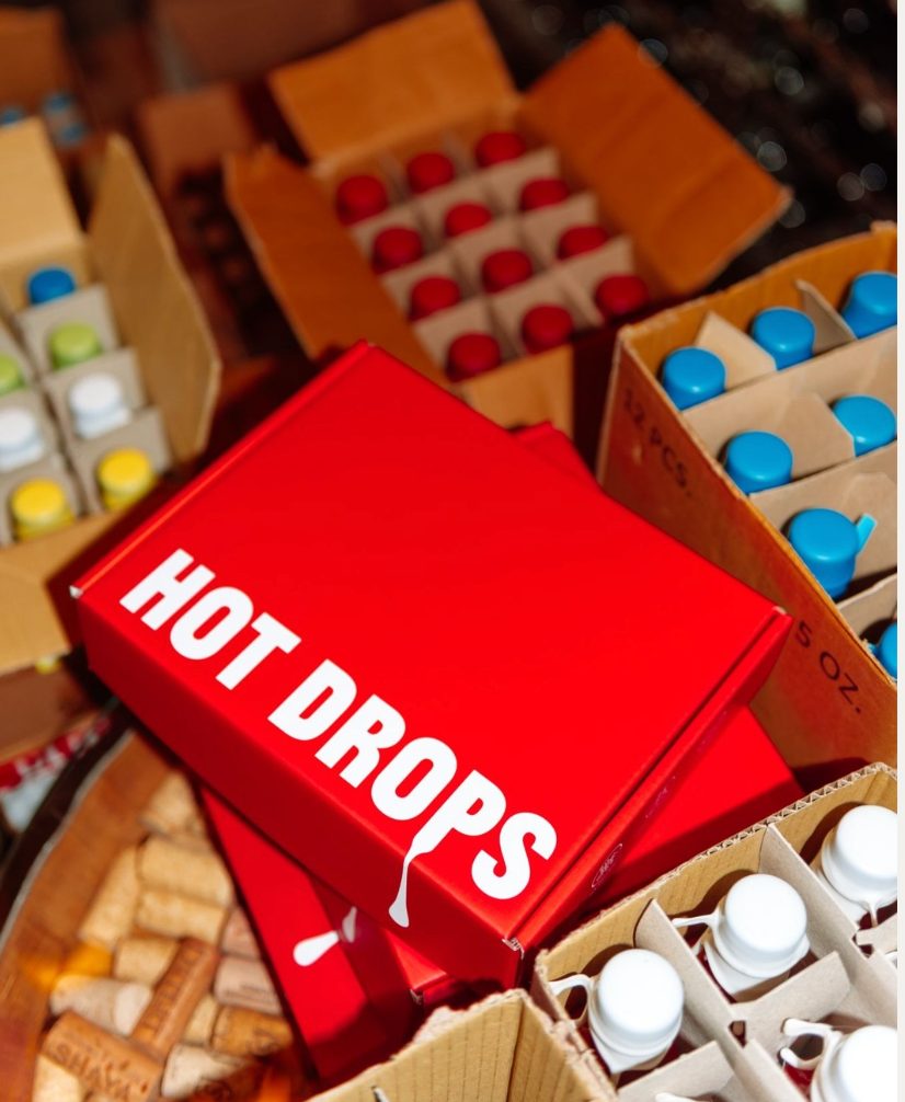
The drip runs off the panel and carries around the front edge of the box, so the mark arrives before the box is even open.
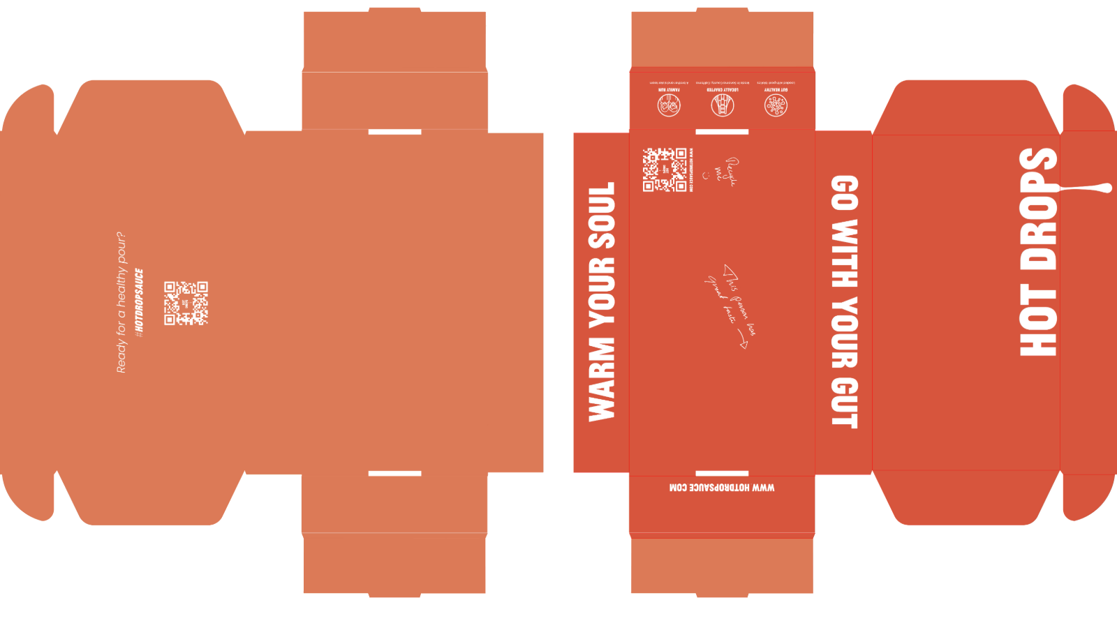
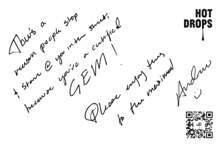
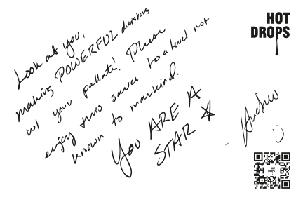
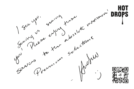
Custom “thank you” notes, signed in the founder's hand, inserted into every mailer.
The system
Every label colour was sampled off the sauce in the bottle. Each carries one core, and the wordmark is knocked out of it so the letterforms fill with whatever colour is inside, and that colour is the one the whole palette is built from.
Label colour on top, the sauce colour it reveals below.
“Hot sauce that warms your soul.”
The activation
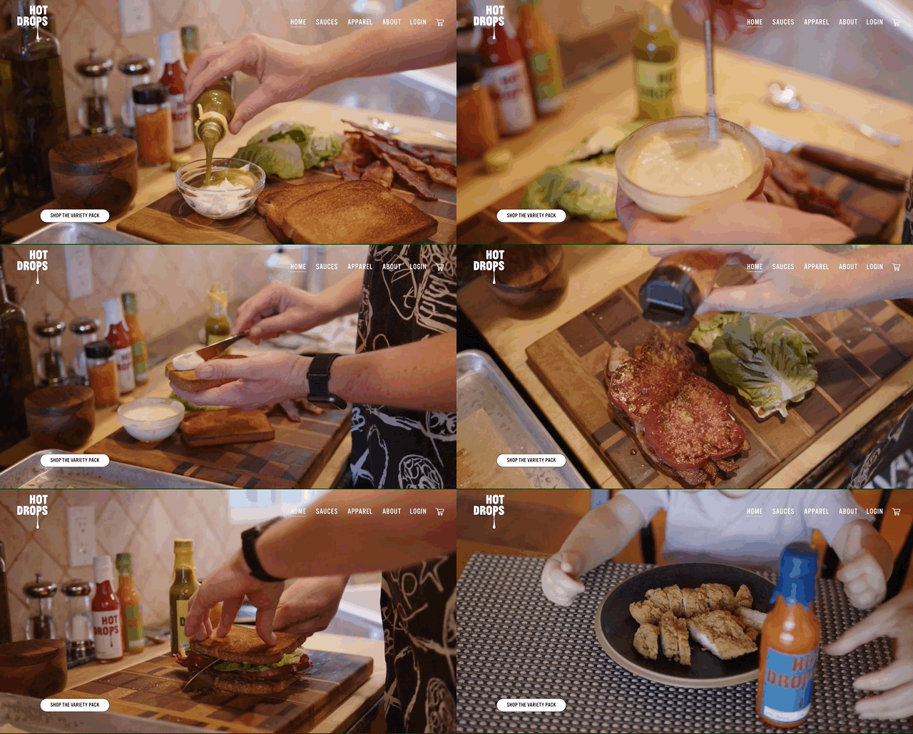
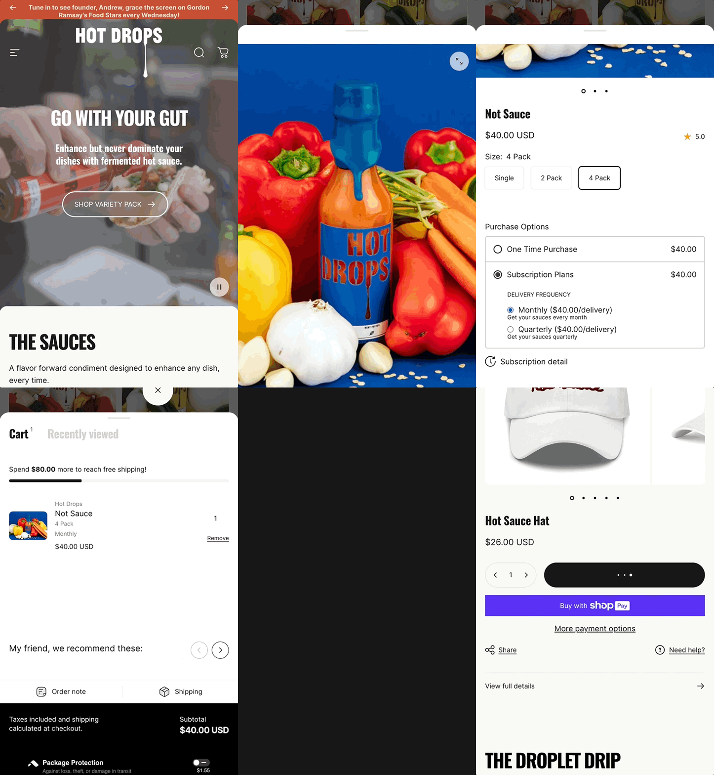
The flavour colour carries the merchandising on mobile too. Each sauce tile holds its ground colour so the grid reads as a shelf even at phone width. Storytelling introduces the mission behind each sauce and leads to a clean product path.
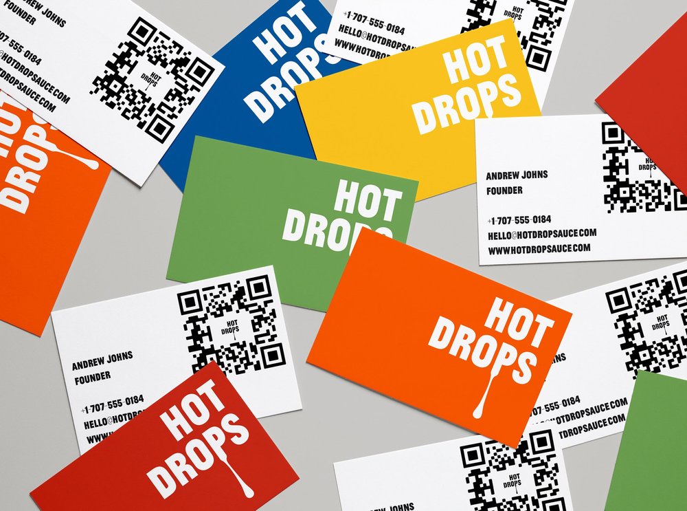
Every run is small. Peppers are brined and left to ferment for 35 days, the sauce is filled on a short line, and labels are applied and checked bottle by bottle, one ink per label to keep short runs affordable. The identity had to survive that: flat colour, a mark that reads on a wet bottle under shop lights, and a label a person can straighten by eye.
The brand reads premium and approachable at the same time. Gordon Ramsay selected Hot Drops for Food Stars and cited both culinary integrity and standout design, and the packaging has been covered by The Dieline, the Press Democrat and Snaxshot.
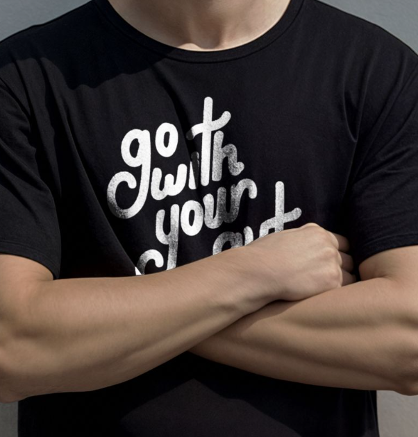
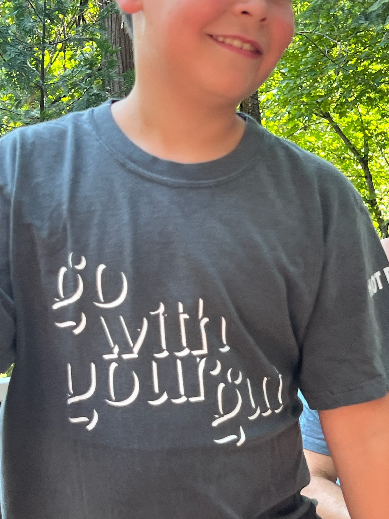
The hand-lettered “go with your gut” line carries the brand onto merch.
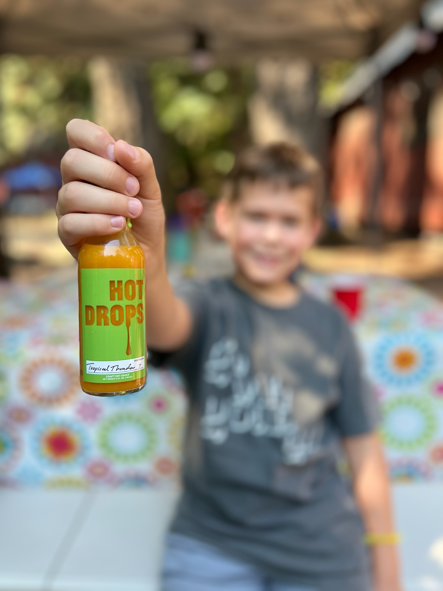
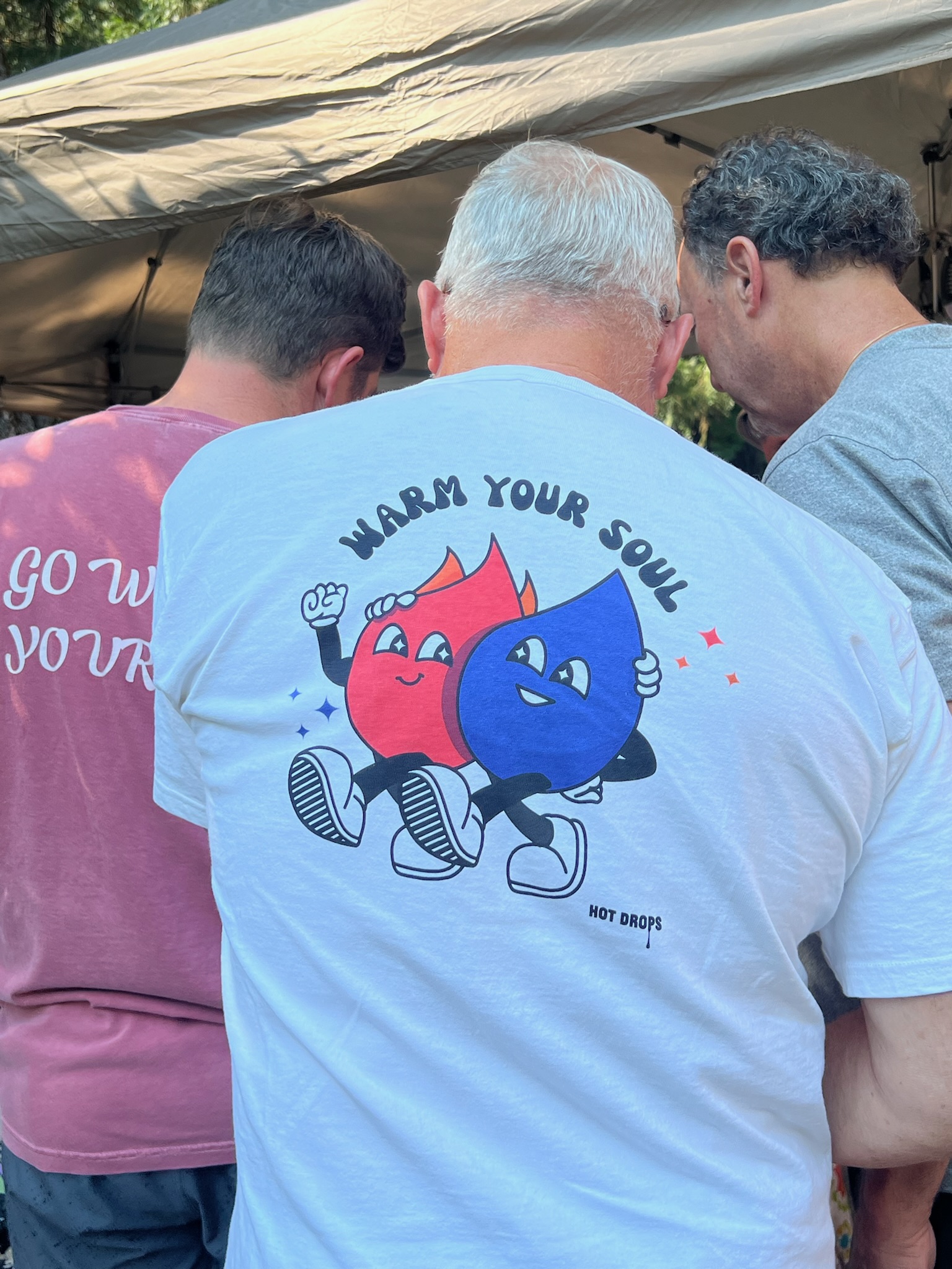
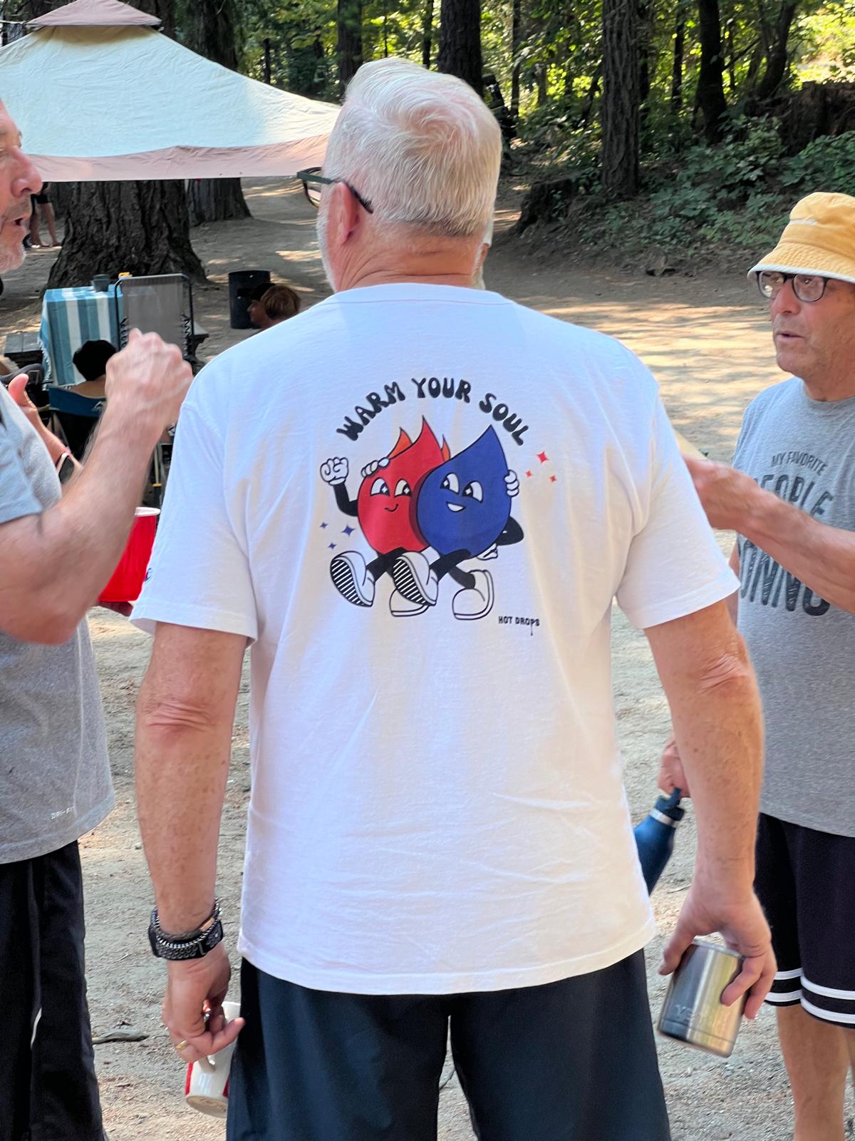
A flame and a drop, arm in arm: the “warm your soul” characters turn heat and sauce into a pair of friends.
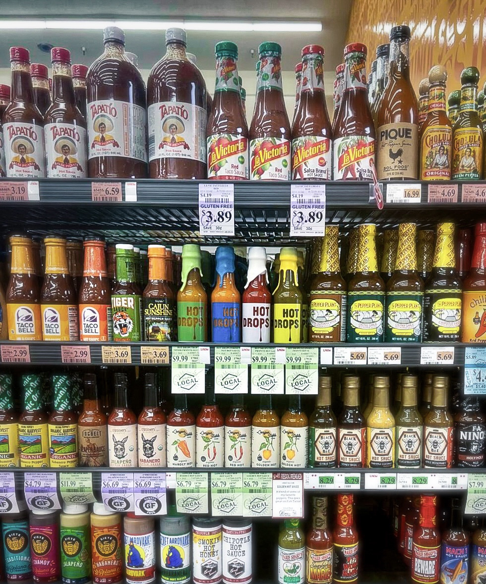
On the shelf, the drip-lettered labels and coloured wax caps stand out from a wall of competitors.