A luxury identity shaped by the bend of the river.
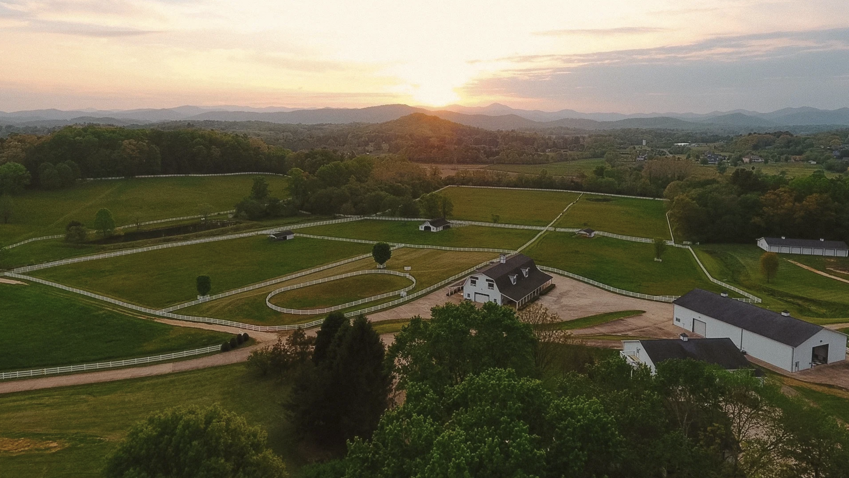
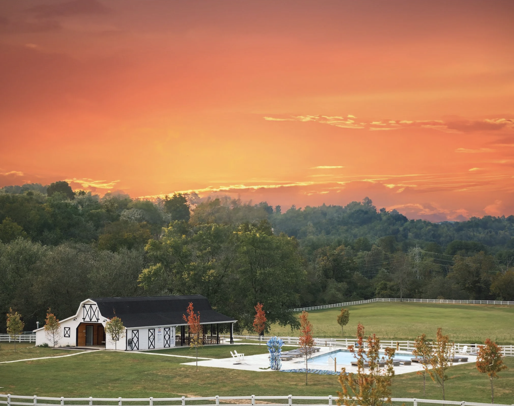
The Horse Shoe Farm sits between the French Broad River and South Rugby Road in Hendersonville, North Carolina. The property is nestled into an iconic bend in the river, and we designed the logo to capture it: the horseshoe traces the curve of the water that wraps around the farm.
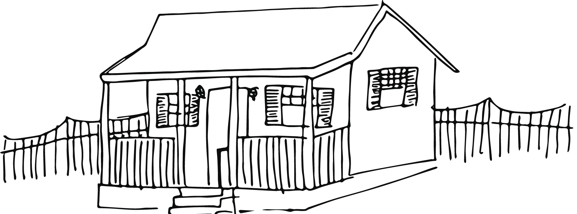
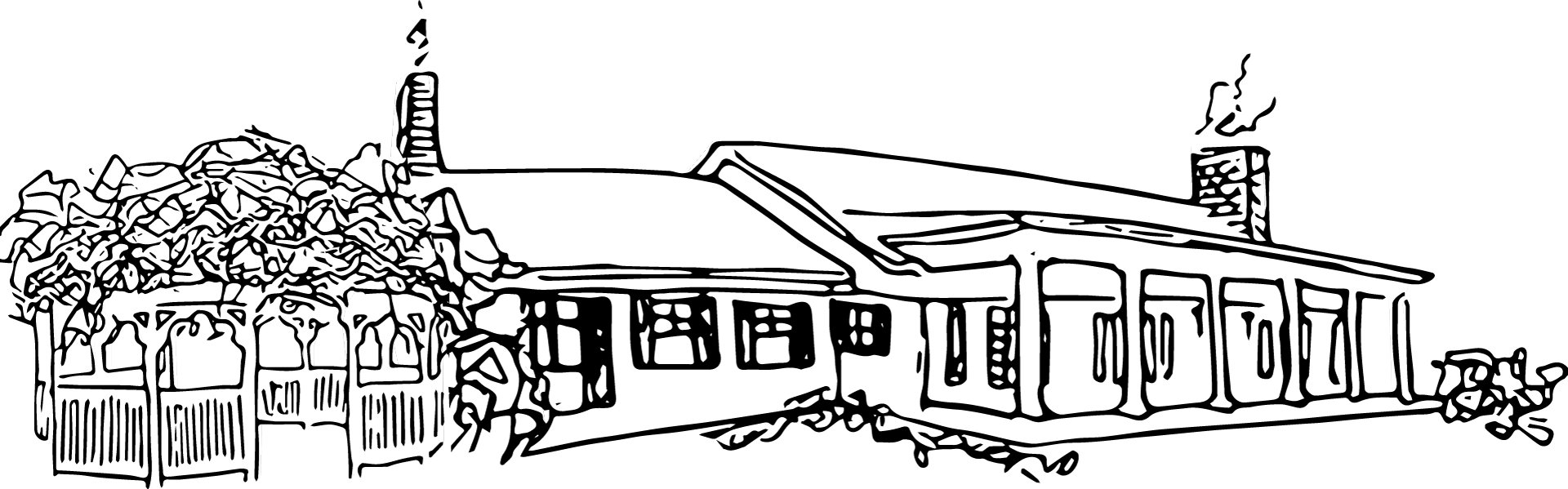
For the property map, we hand drew each building, from the Magnolia Manor to the Hen House, to give the farm the rustic, authentic look they wanted.
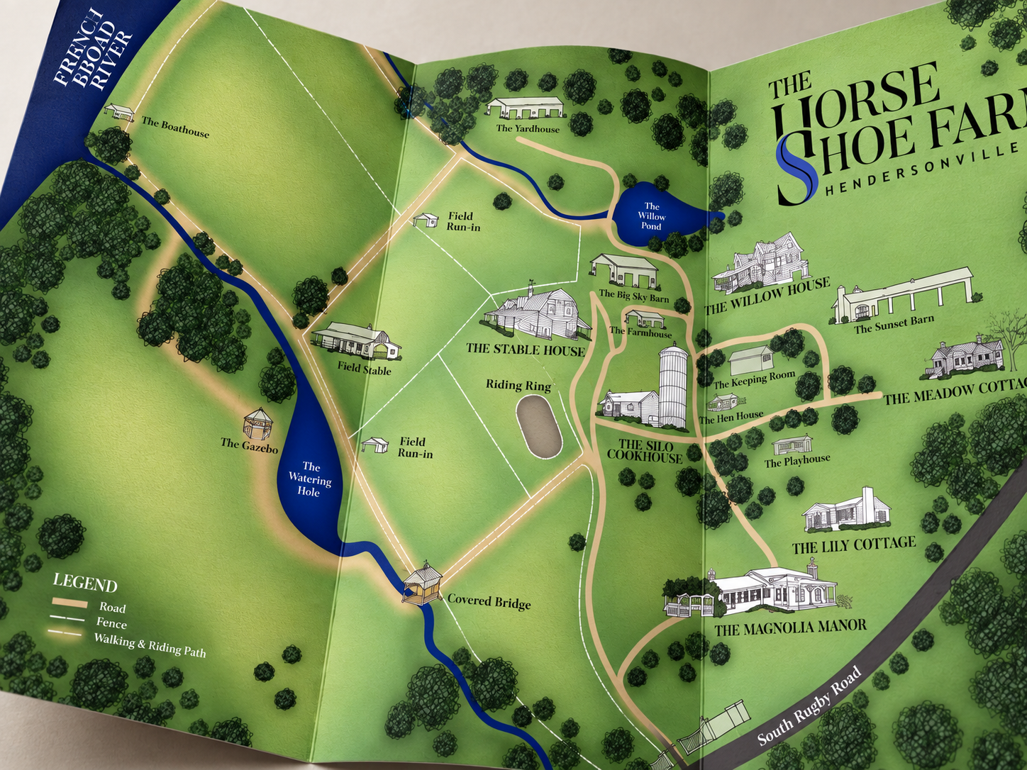
Printed as a trifold for guests. Each building is drawn in loose, hand-inked line work, from the clapboard cottages to the silo and barns, set into soft green fields, winding paths and the deep blue of the river.
Marks & lockups
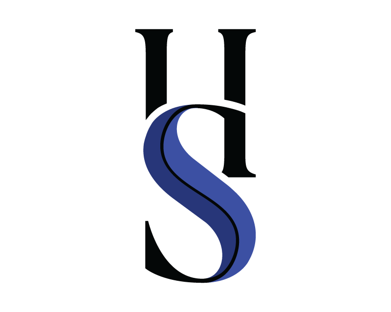
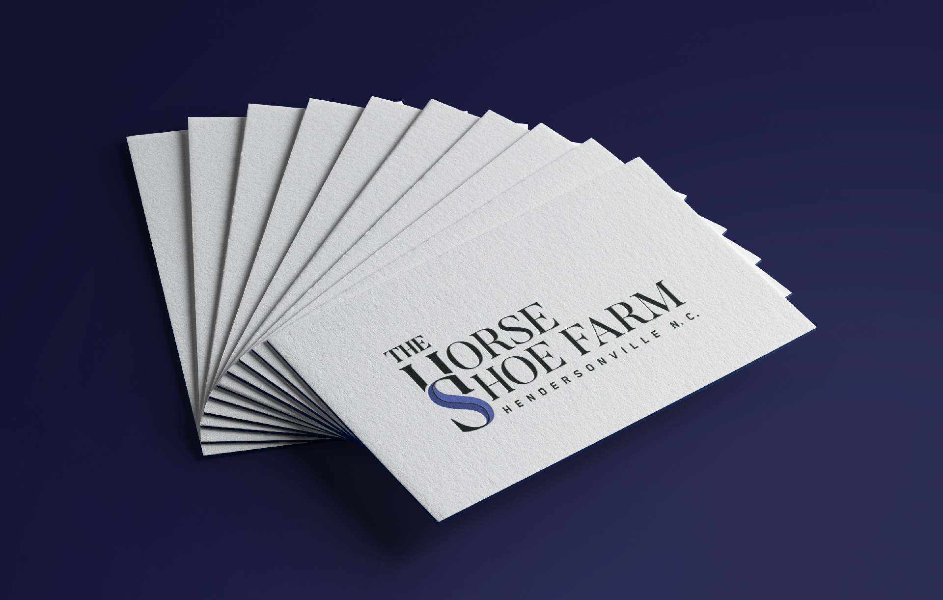
The horseshoe follows the bend of the river that wraps the farm, tying the identity to the land itself. Paired with a high-contrast serif, it gives the farm the sophisticated, luxury feel the owners wanted. Each mark serves a different purpose for the brand: the primary logo leads across everyday touchpoints, the large-format logo is built for signage and large print, and the HS monogram carries the brand in small, crafted details like saddle leather.
The site
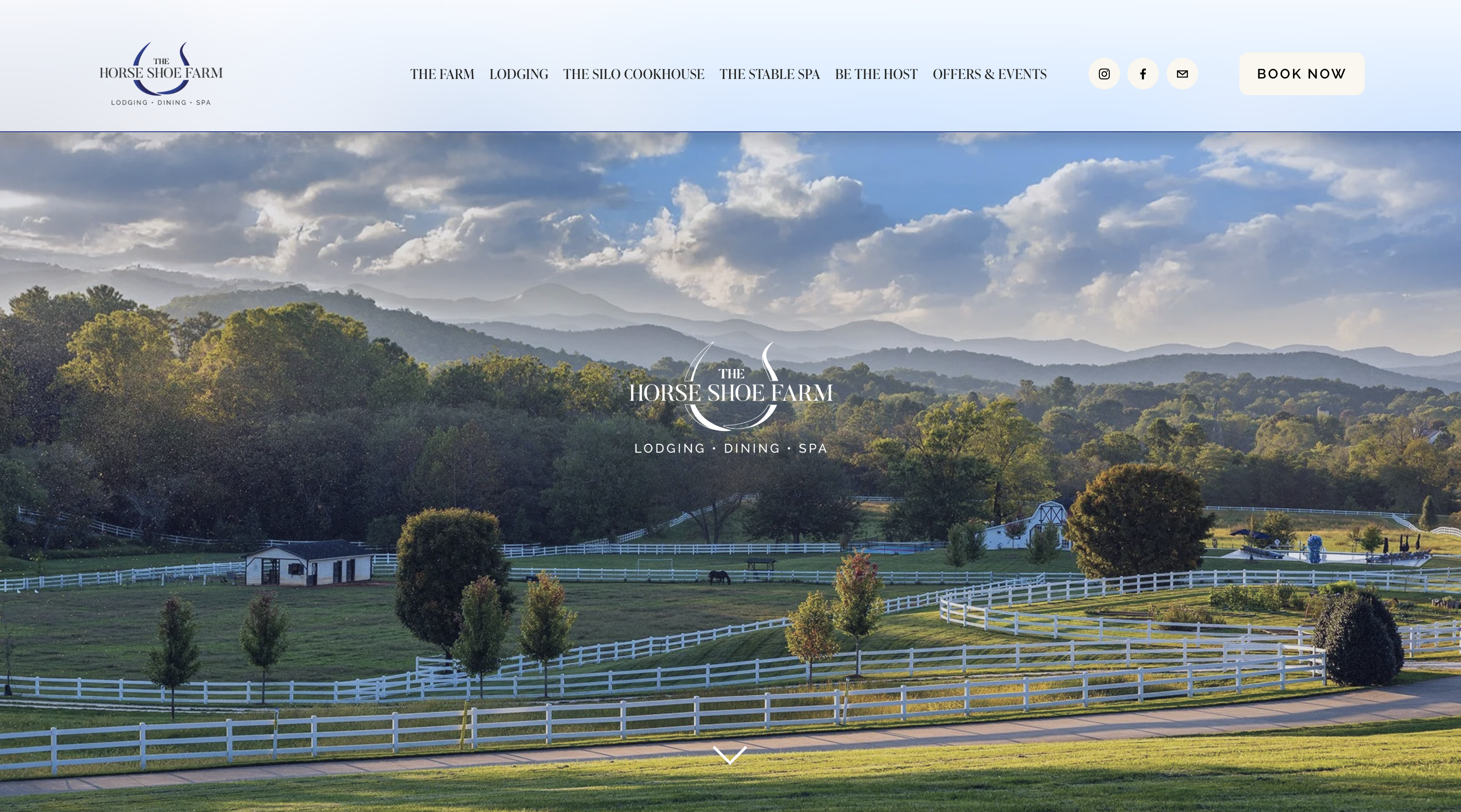
The site carries the identity online: the horseshoe and serif lead, and the farm’s three offers, lodging, dining and spa, sit beneath it the way they do on the logo.
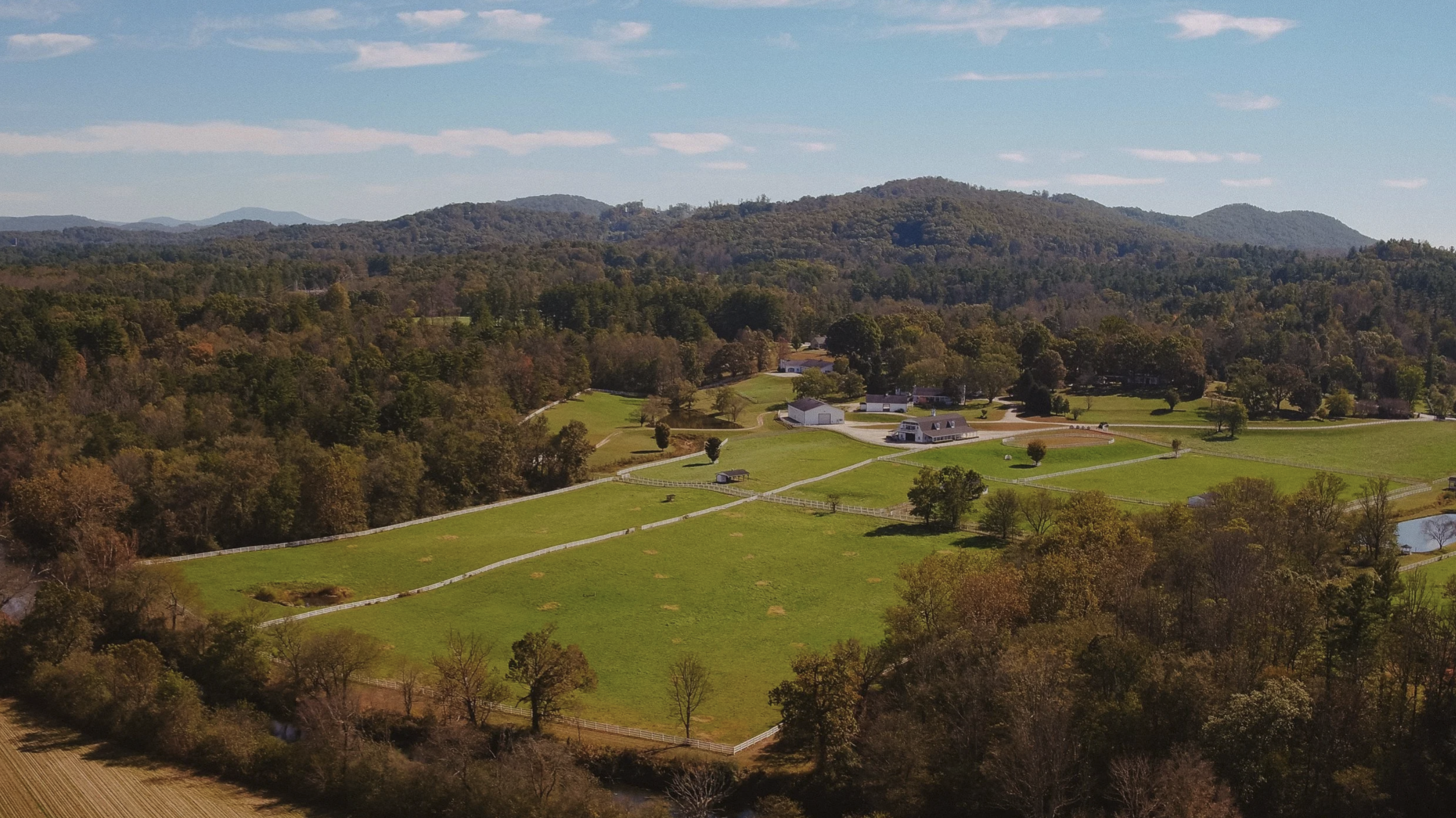
The navy and soft blues in the palette come from the farm itself: dusk skies, river water and the Blue Ridge on the horizon.
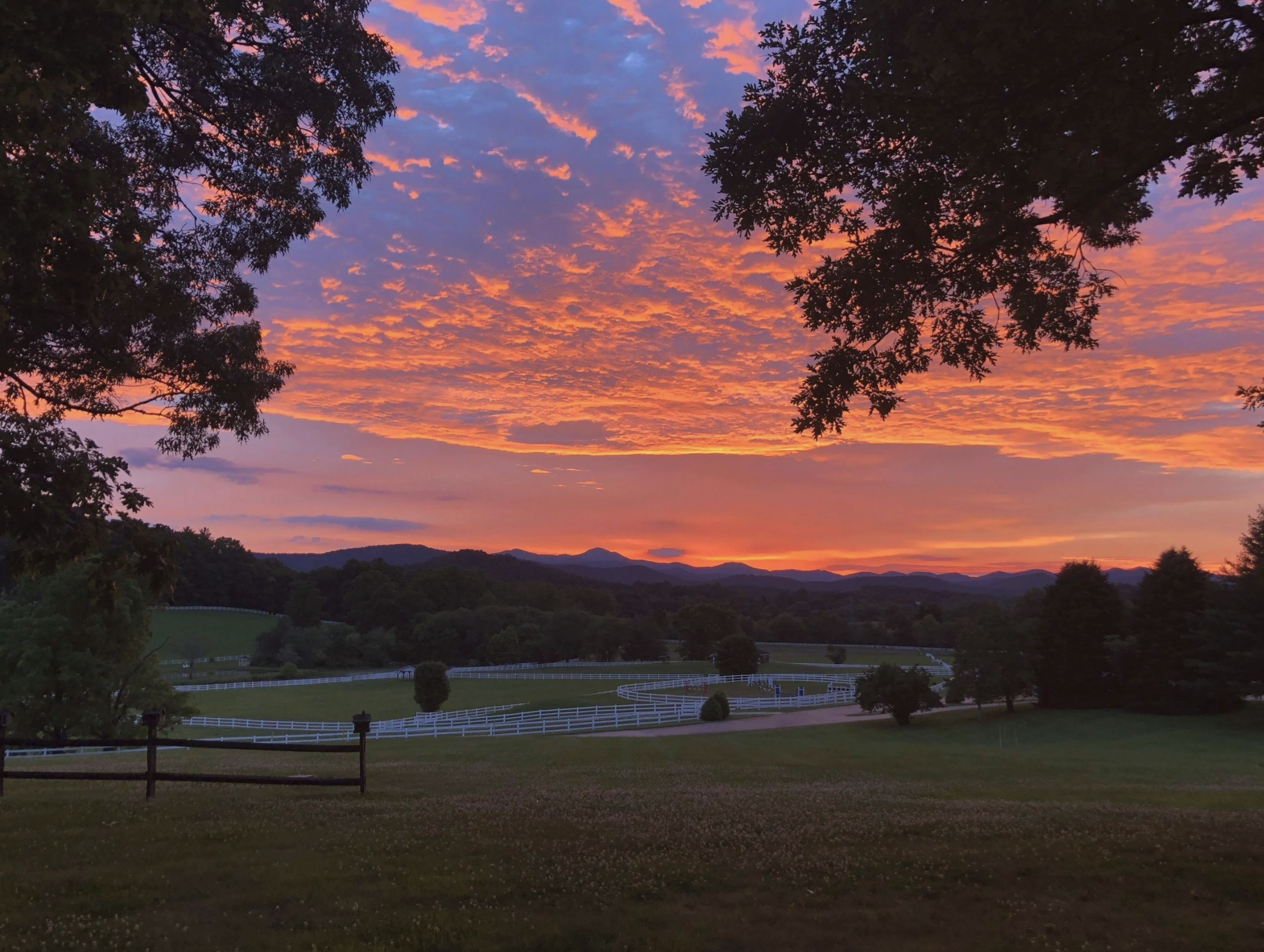
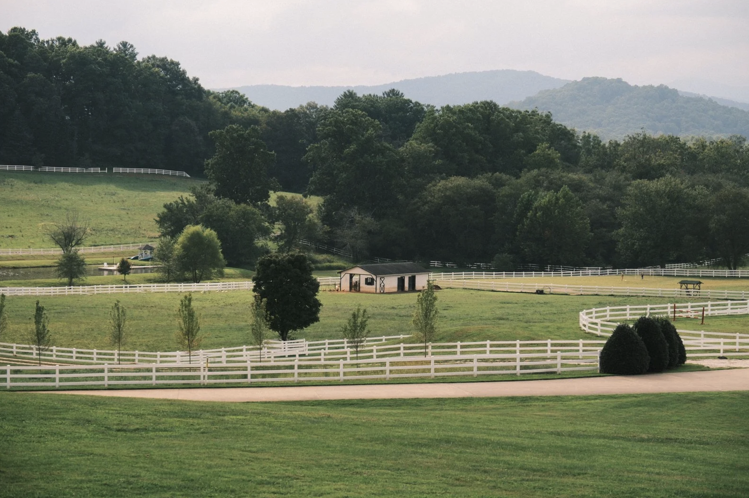
The open, unhurried pace of the land set the tone for the brand: generous space, restrained type and nothing that competes with the view.
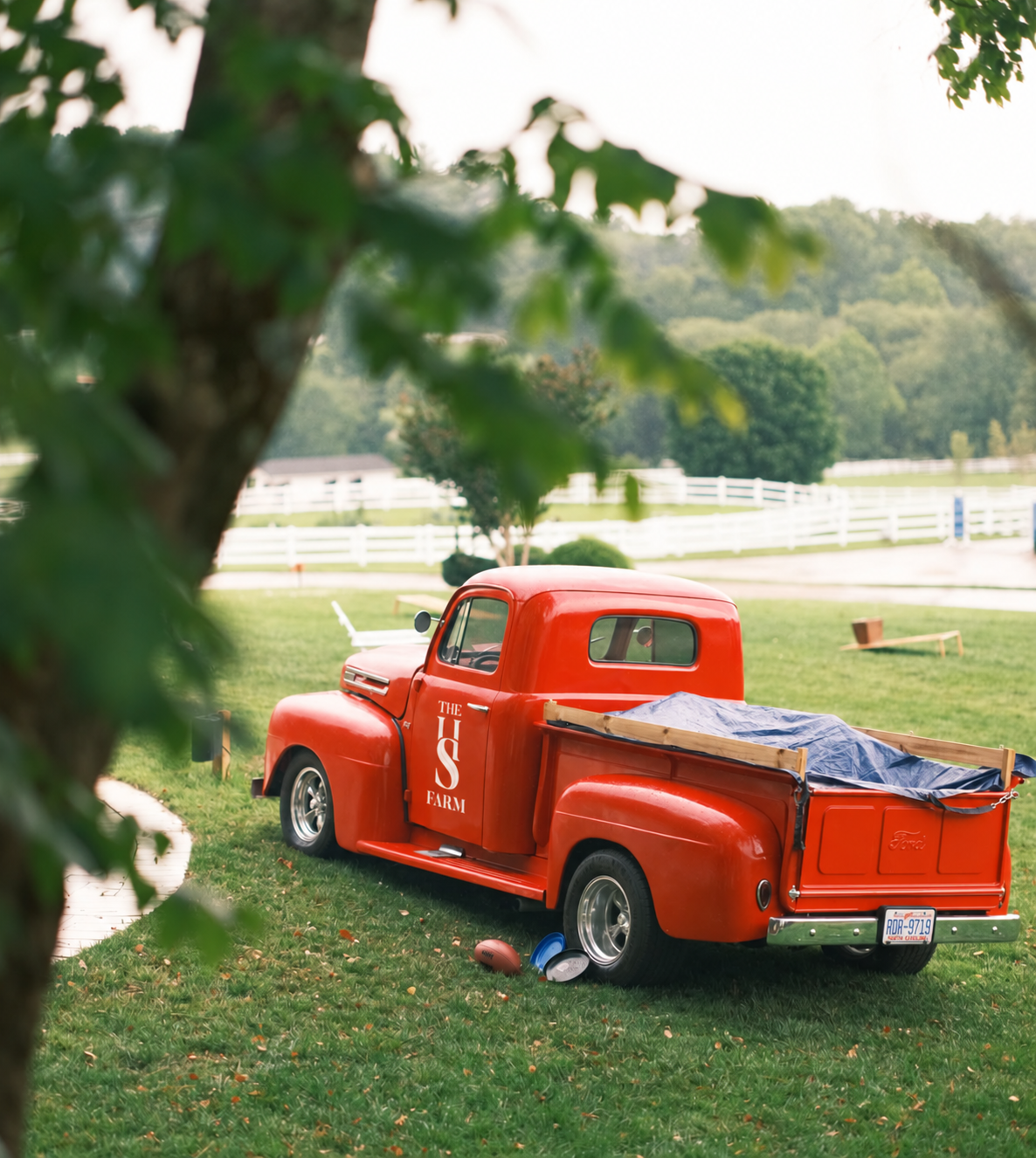
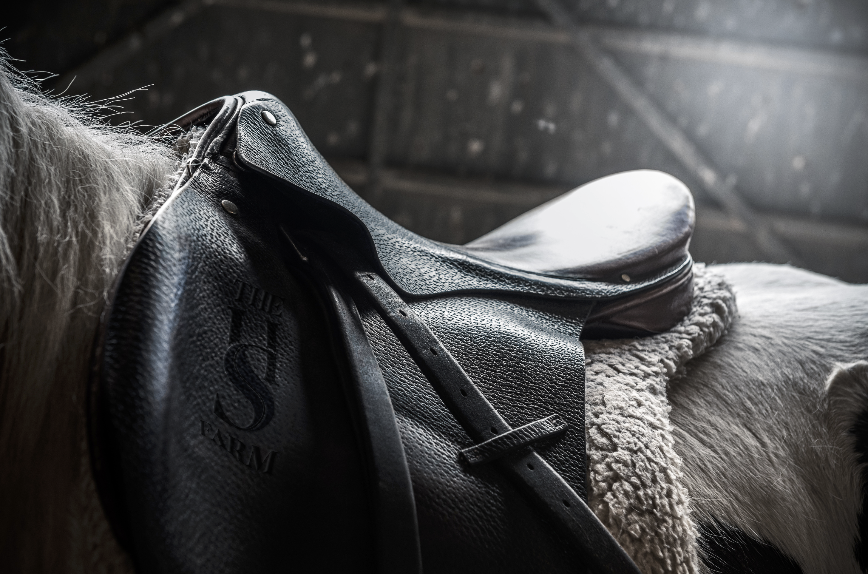
The HS monogram was drawn to work at the scale of craft, embossed in saddle leather the way a ranch brand would be.

Lodging
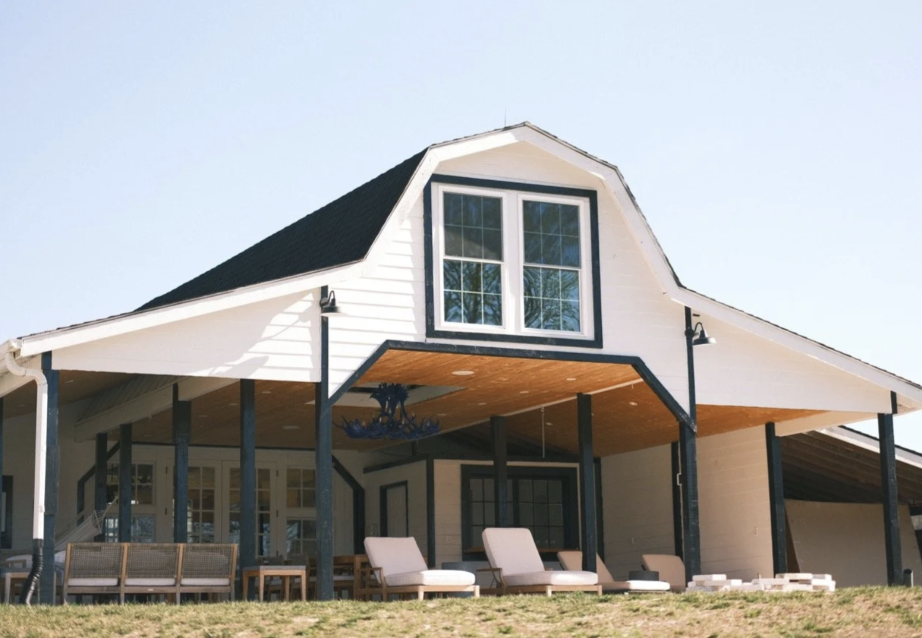
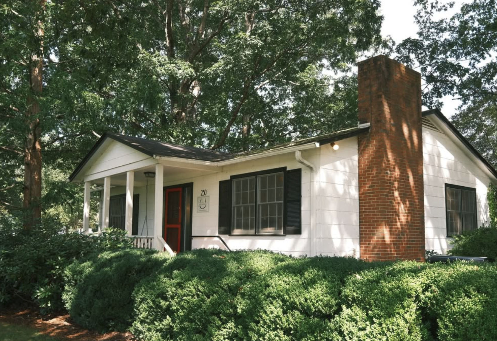
Every house on the property is named, and each carries the horseshoe on a plaque by the door, tying the buildings on the map to the buildings on the ground.
Simple white plaques let the mark sit quietly against the farm’s clapboard and brick.
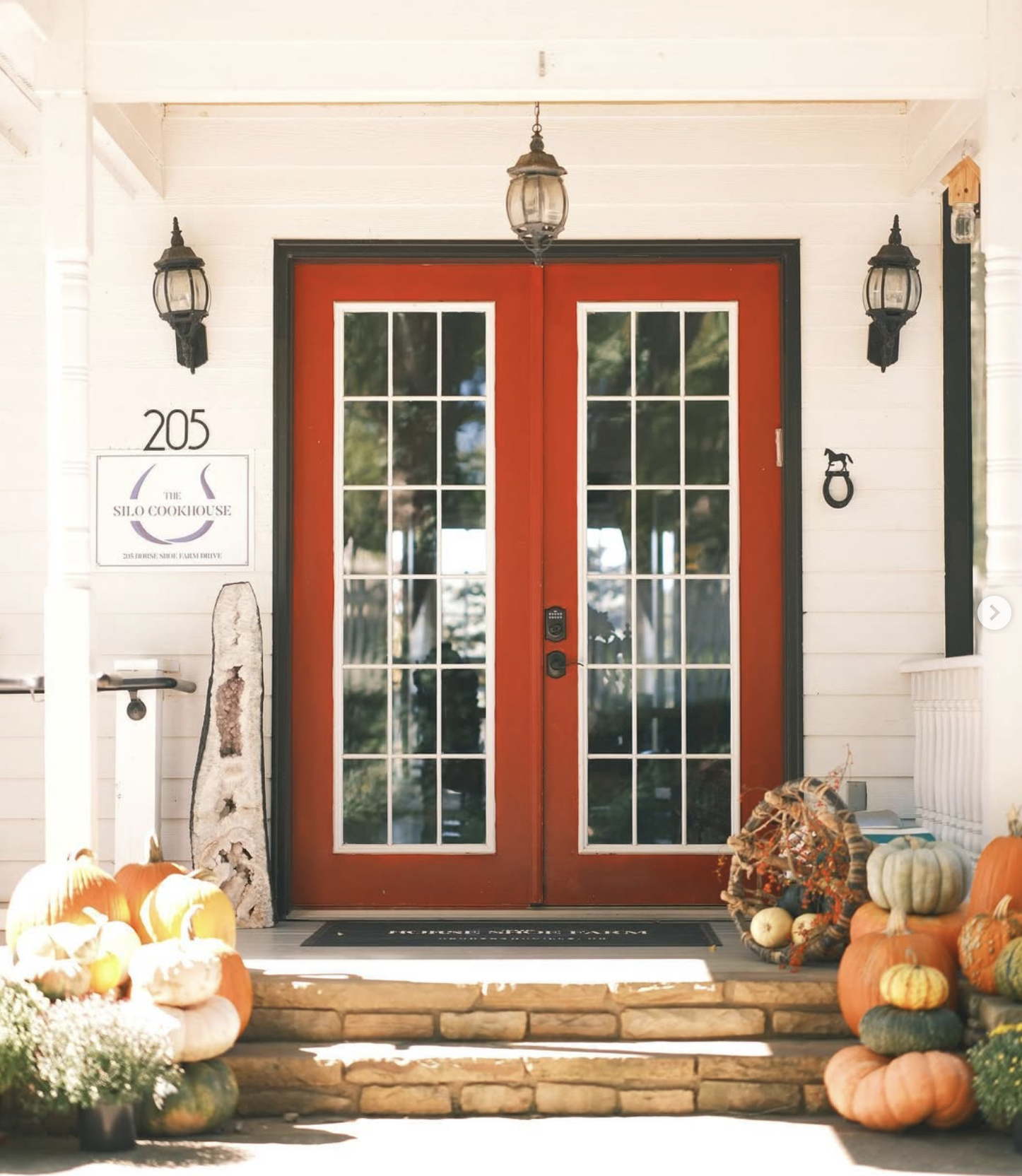
The Silo Cookhouse
The restaurant shares the horseshoe and serif as its own sub-brand, so it reads as part of the farm while having a name of its own.

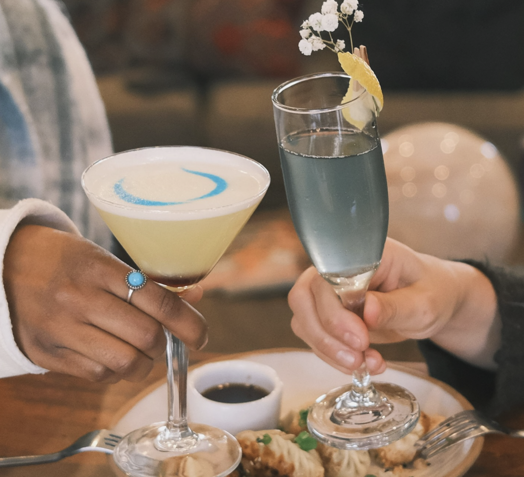
The horseshoe’s curve is simple enough to draw by hand, here in blue across the top of a cocktail.

The Stable Spa
The spa takes its name from the farm’s working history, and its identity uses the same horseshoe to keep it part of the property.
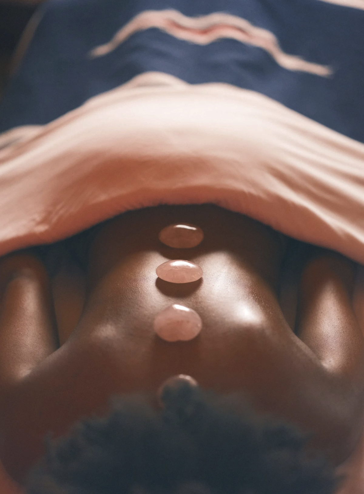
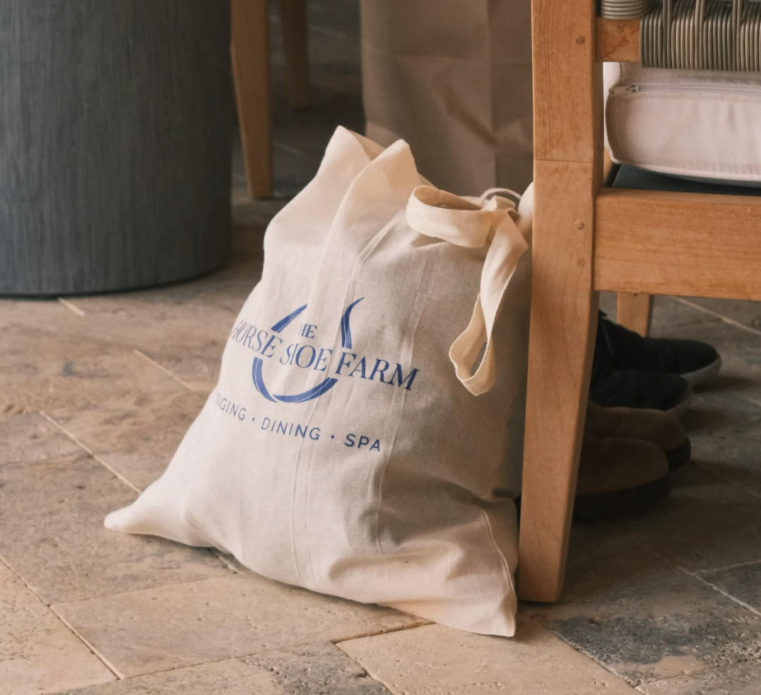
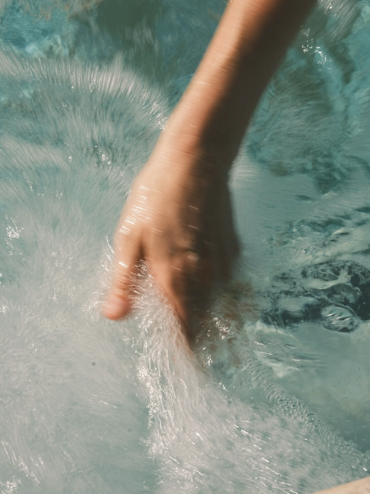
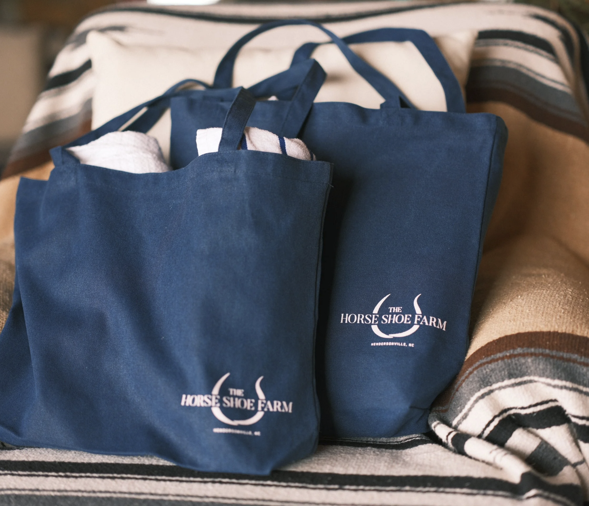
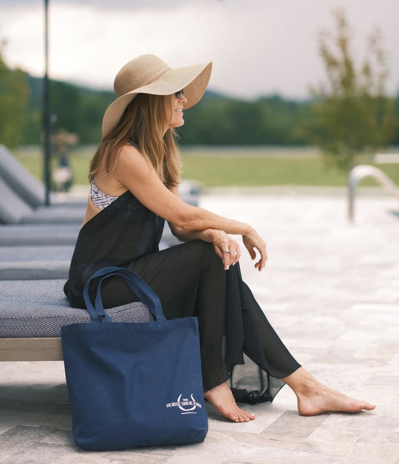
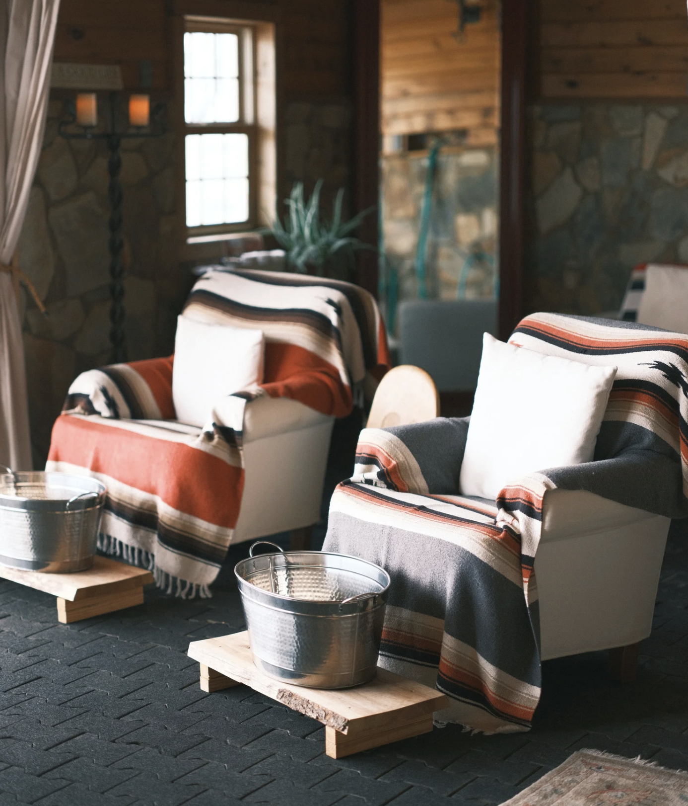
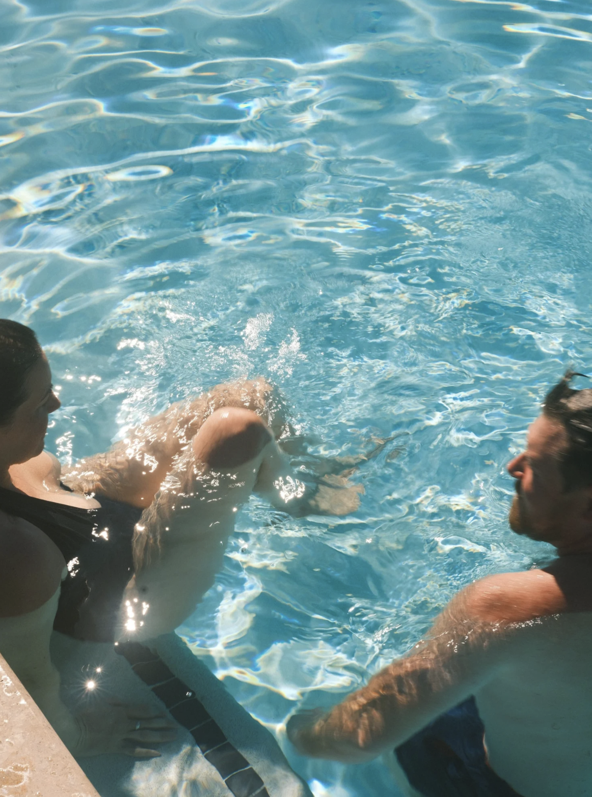
The spa’s materials, water, stone and wool, informed the softer, tactile side of the brand.
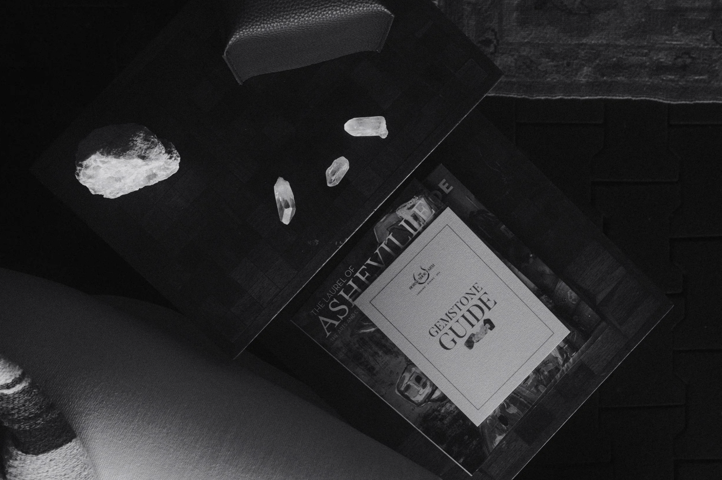
Print pieces like the gemstone guide extend the serif and horseshoe into the treatment rooms.
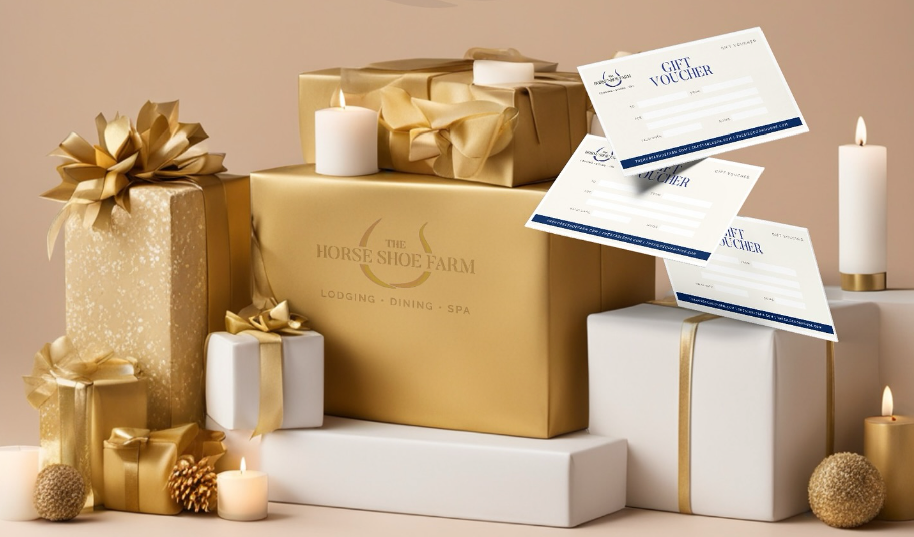
Gift certificates bring lodging, dining and spa together under the one mark.
Events
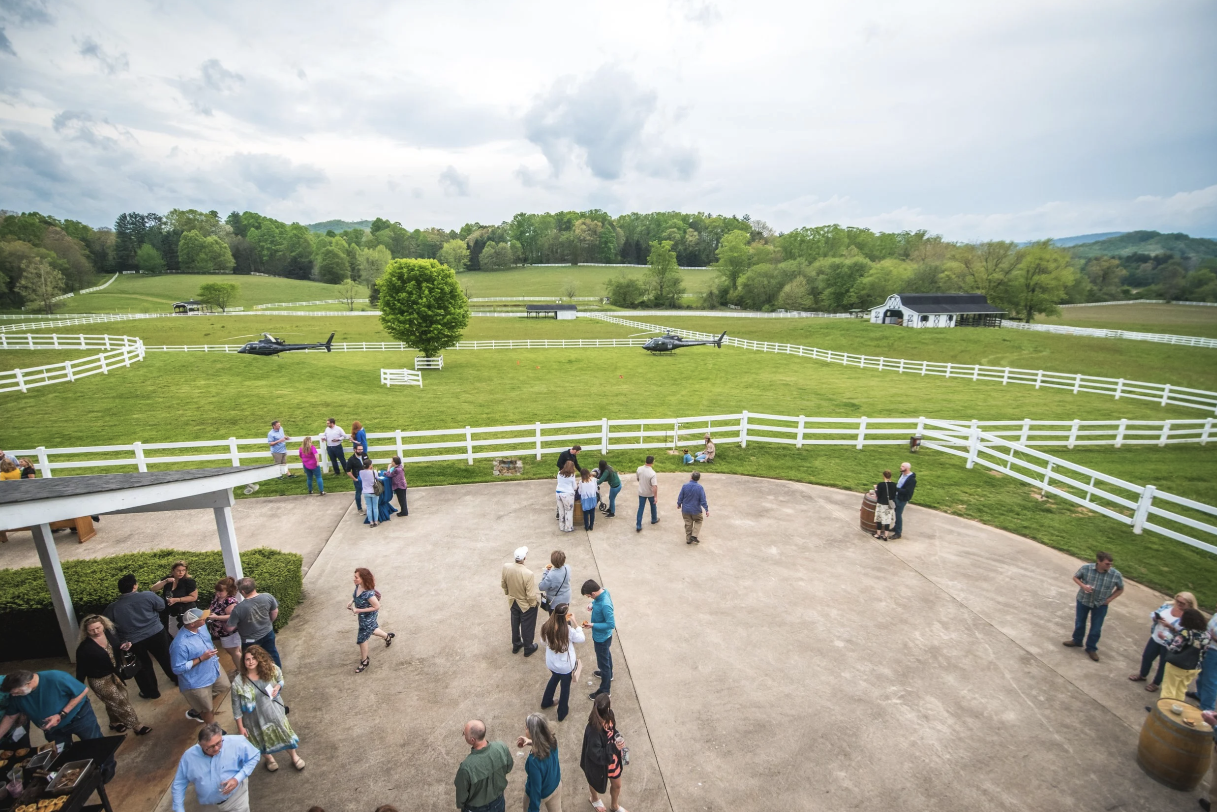
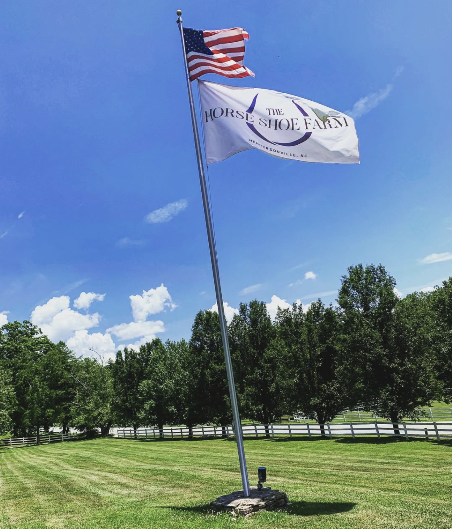
For weddings, retreats and arrivals by helicopter, the identity scales from flags and signage to printed menus and guest materials.